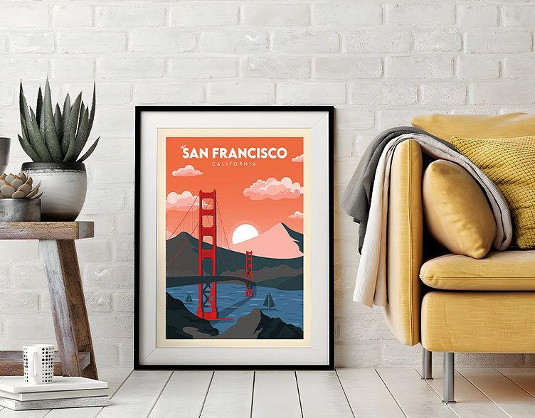
San Francisco Travel Poster Design
San Francisco Travel Poster Design
Behold the vibrant charm of San Francisco captured in a kaleidoscope of colors on this travel poster. The iconic Golden Gate Bridge stands majestically against the backdrop of a sun-kissed skyline, inviting you into a city pulsating with diversity, culture, and innovation. From the historic cable cars traversing steep hills to the serene beauty of Alcatraz Island, this poster encapsulates the essence of a city where history meets modernity.
Design Issues:
Cluttered Composition: Sometimes, travel posters can become too crowded with various elements, making it challenging for the viewer to focus.
Color Overload: The excessive use of colors might distract from the main focal points or overwhelm the viewer.
Text Legibility: Poor choice of fonts or text placement can hinder readability and diminish the overall impact.
Solutions:
Streamlined Composition: Simplify the design by focusing on a few key elements that best represent San Francisco. Highlight the most iconic landmarks without overcrowding the poster.
Balanced Color Palette: Opt for a more balanced and harmonious color scheme that enhances the overall visual appeal without overpowering the main elements.
Clear Typography: Choose legible fonts and strategically place text to guide the viewer without overshadowing the visual elements. Consider using contrasting colors for text to improve readability against the backdrop.
Order Now On Fiverr
https://www.fiverr.com/marjanofficial/do-modern-retro-vintage-minimalist-travel-poster
Let's chat about your project.
Gmail: travelposterbd@gmail.com
What's up
+8801979290535


