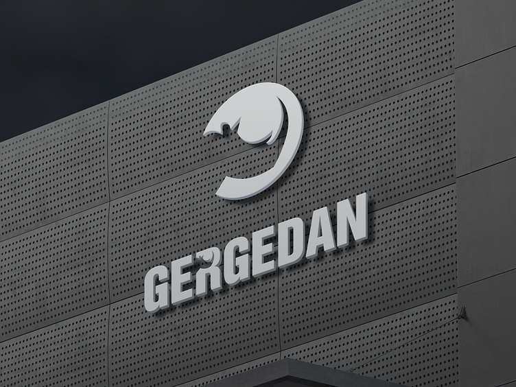
Gergedan: A Logo Design for Spare Parts Company
The Name: Gergedan means rhinoceros in Turkish. I chose this name because rhinos are powerful, resilient, and unique animals. They also have a distinctive horn, which is a symbol of strength and protection.
The Logo: The logo is a white rhinoceros head in profile, facing left. I wanted to create a logo that would reflect the qualities of the name and the products. I used a minimalist and geometric style to create a sleek and modern design. I also added some details and textures to make the logo more realistic and appealing.
The Color: I chose a gray background with a perforated texture to represent the metal and mechanical aspects of the products. I also chose a white color for the logo to create a contrast and to highlight the shape and details of the logo.
The Font: I used a sans serif font for the word Gergedan, which is written in all caps below the logo. I wanted to use a font that would match the logo and the products. I chose a simple and modern font that is easy to read and to remember. I hope you like my logo design for Gergedan. I think it creates a strong visual identity and a memorable impression. If you need a logo for your brand, feel free to contact me. I’d love to work with you.
