E-commerce for the Italian furniture
Hi, Dribbble 👋
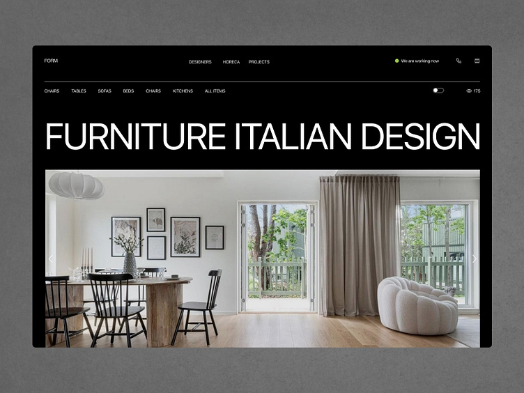
I'm happy to share with you the design of the first e-commerce screen for Italian Furniture. The design was done in a minimalist style to accent the premium and uniqueness of the brand. It was done in day and night modes.
In the previous picture, I showed the day mode and now I am showing the night mode.
Which one do you like more?
Don't forget to click ❤️ if you liked it.
I'm open to new projects in different niches.
Let’s discuss your project:
You can find me here:
More by Viktoriia Pashkovska View profile
Like
