The New Shyp
Today marks a new day for Shyp. We've rebranded, and in turn, redesigned nearly everything. We leveraged this rebrand to take a step back, deeply think about the identity of our company, and lay the foundation for where we'll go over the years to come.
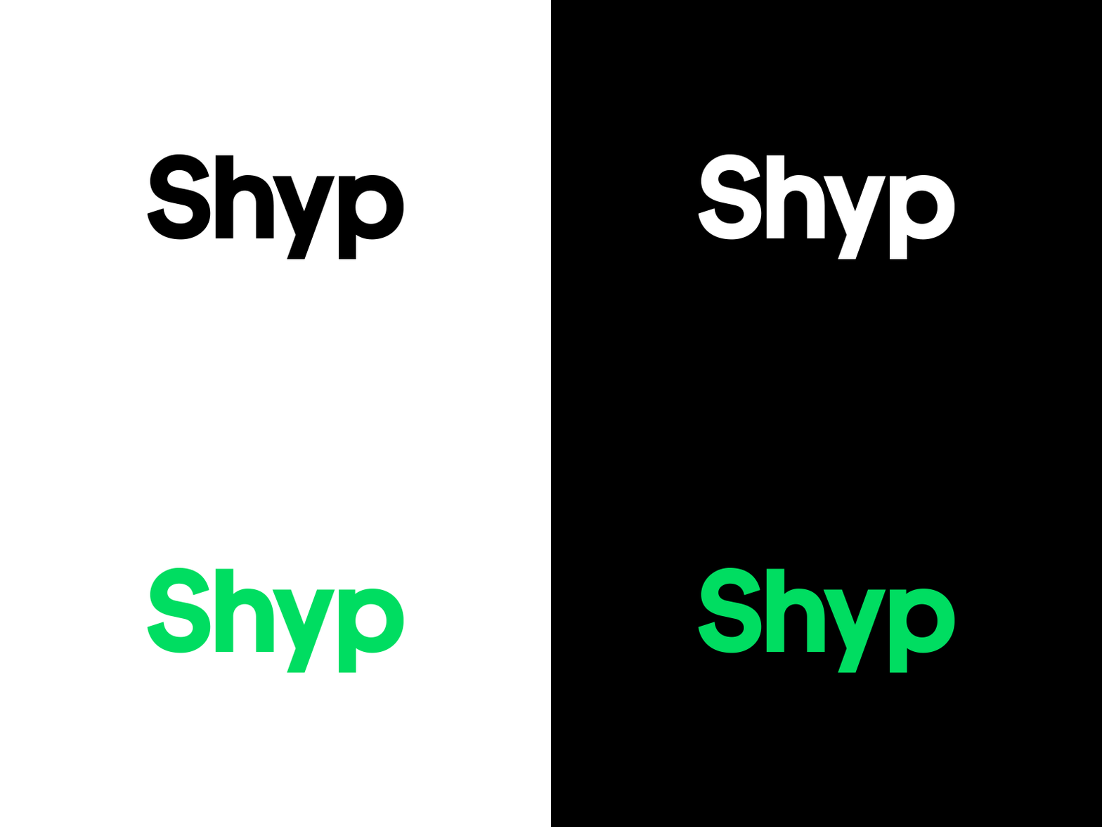
There's a lot to unfold with our brand, but let's start with the logo. It's a well-considered, custom wordmark that is simple in appearance but meticulously crafted in its form. Carefully measured and bold, our logo exudes confidence. As a nod to that confidence, we gravitated towards a wordmark that can stand on its own — no symbol needed.
While white and black are ever present throughout our new direction, we've introduced a vibrant green that allows us to make a strong impression when we express the brand. It speaks to the how we're reinvigorating an archaic industry.
Some truly incredible people were involved in this project, and I couldn't be more proud of the team.


