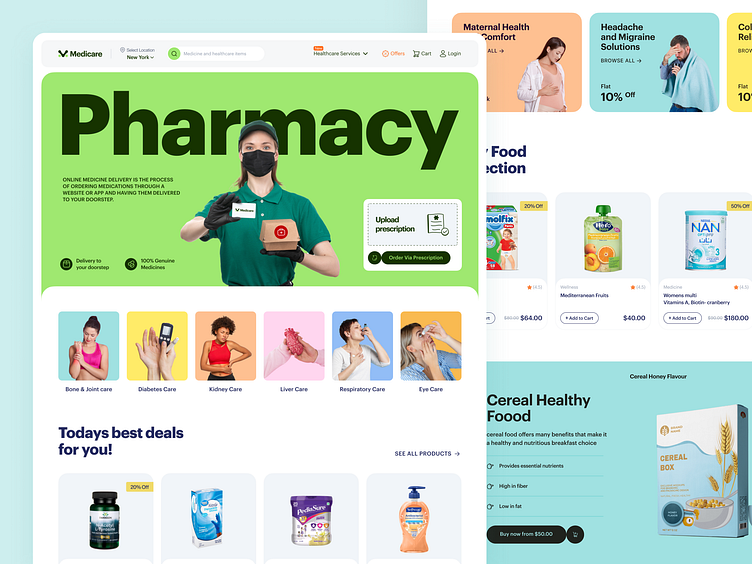
Medical Website | Pharmacy Website Landing Page.
When people shop for pharmacy goods, they desire fast delivery and an effortless ordering process. So, we've crafted the landing page model, accentuating light green to convey a sense of time-saving and convenience. Additionally, it will give users a fresh and comfortable vibe through intuitive UI elements such as images, icons, and buttons.
What are your thoughts on this idea?
Another Preview 👓
Mockup Preview 💻
Have a project in mind? Send us an email or book a meeting via our website.
📩 hello@musemind.agency 🌐 musemind.agency
Full Preview🚀
We appreciate your interest, Dribbblers! 😍
Schedule a call at ☎️ 👉🏼 Calendly.com
Let's talk about your project..
✉️ hello@musemind.agency
Website 🌐 musemind.agency
Explore Our Design Case Study Featuring ➡️ Behance
Let's Check Our Others Dribbble Profile
musemind saas • musemind mobile • musemind branding
Follow us to see more exciting shots and insights on
Linkedin I Instagram I Twitter I Medium I Facebook I Webflow I WhatsApp


