Daily Logo Challenge: Day 2 - Concept #2


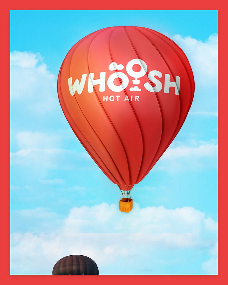
Hot Air Balloon Logo: Whoosh
The Whoosh brand represents fun and playfulness. The company is targeting demographics of all ages and wants to bring hot air ballooning to the mainstream. It was important to capture a child-like essence that can captive younger patrons, while offering a sense of nostalgia encouraging older patrons to get in tune with their inner child as they prepare for the experience of a lifetime. The logo needed to feel playful and handcrafted, almost as if it was sketched with a marker during art class in elementary school.
Primary Logo
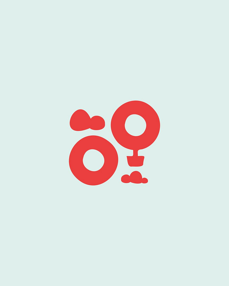
The primary lockup has two parts: the logomark (the two O’s and the clouds) and the wordmark itself (“Whoosh”). The O’s were used to convey 2 of the core elements of the brand, the balloon and a minimalistic version of the sun. The logomark conveys movement as the balloon rises above the sun. This lockup will be the most commonly used, but the following pages outline the principles behind both elements, and how to use them most effectively across the brand.
Secondary Logo
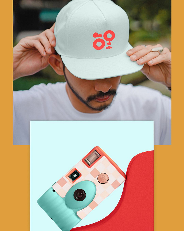
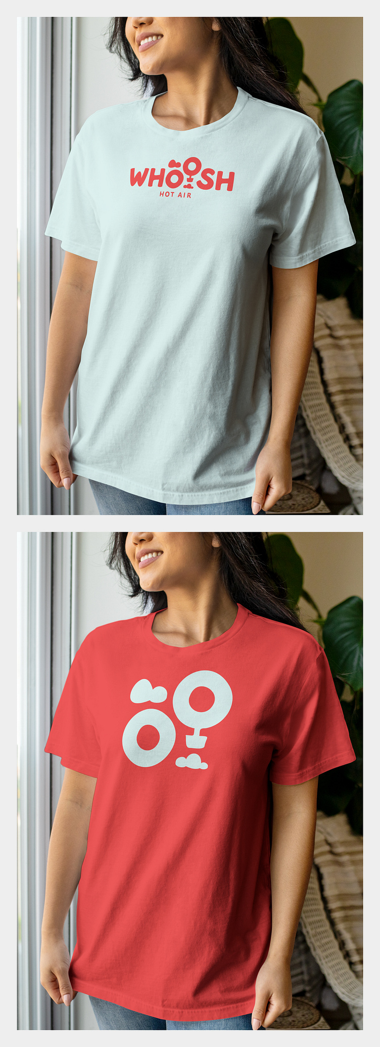
The logomark alone can be used alone to create fun physical brand assets such as pins and stickers. If used alone for marketing materials such as posters (physical and digital), t-shirts and a variety of other artifacts, it should be accompanied by the wordmark somewhere. It can also be leveraged for digital use, specifically in the case of the app icon.