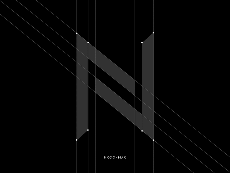
Design system for NODO Film Systems | Lazarev.
Hey there, Dribbble enthusiasts 🤠
We're wrapping up this series with a focus on something crucial — the design system.
It's a big deal because it ensures that everything on the promo page for NODO Inertia Wheels MAX is consistent, aligns with their brand identity, and creates a great user experience.
The NODO site design system, developed by Lazarev., closely adheres to the brand identity guidelines but with some cool tweaks.
We aimed to blend the engineering vibe with vibrant gradients to make it stand out. The Mont font, with its geometric precision, adds a nice balance to the playful, tech-driven look we were aiming for.
So, what are your thoughts on this design? Let's chat in the comments!
More by Lazarev. UI/UX Design Agency View profile
Like


