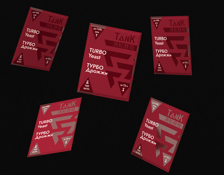
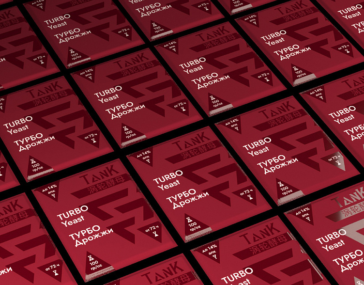
Branding Packaging Design Wine Yeast TANK Concept
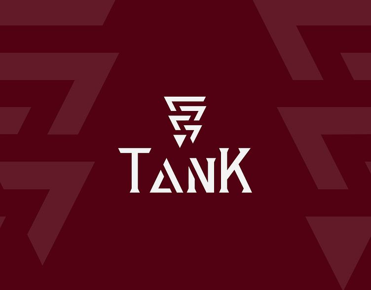
When developing a logo for the brand "TanK" - yeast for winemaking, I tried to convey the uniqueness and character of the product itself, as well as give it a memorable image.
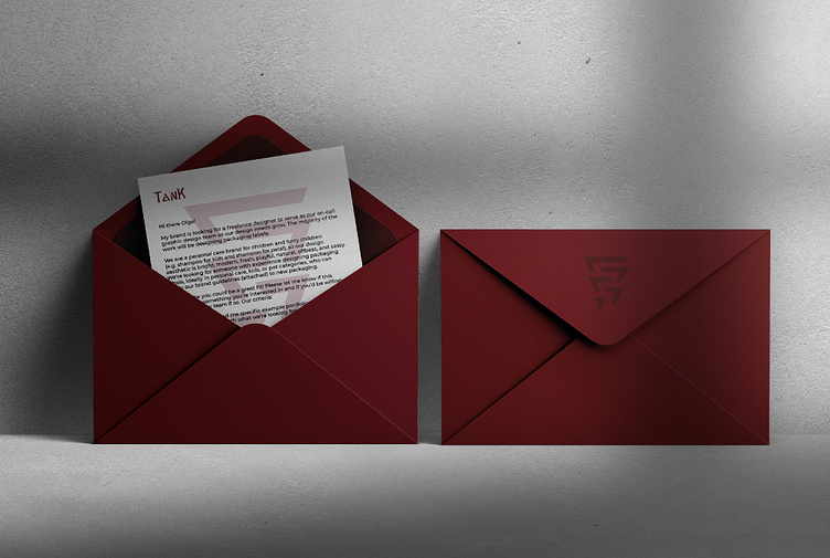
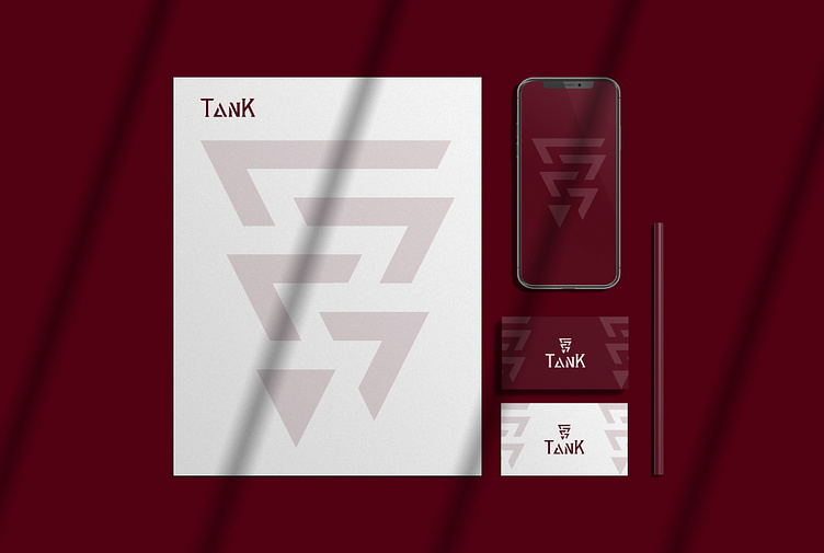
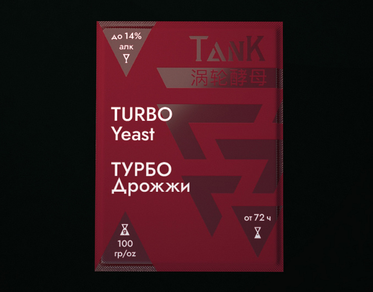
The main element of the logo is intertwined triangles, which symbolize not just a bunch of grapes, but the five main stages of creating quality wine.
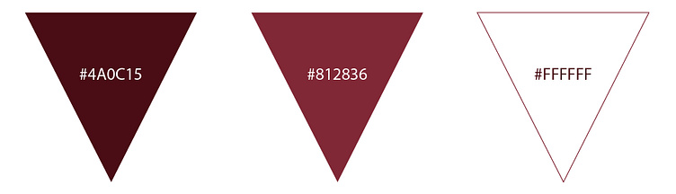
The color scheme of the "TanK" logo is based on shades of burgundy and white - these are colors that are associated with the purity, growth and ripeness of grapes. It also helps to make an emotional impression on the consumer and evokes associations with fertility and quality.
The font rendered for the logo has simple geometry to convey clarity and ease of use of the product. Triangular shaped letters make the logo look more modern and stylish.
In general, the developed "TanK" logo stands out from its competitors and attracts attention with its originality.