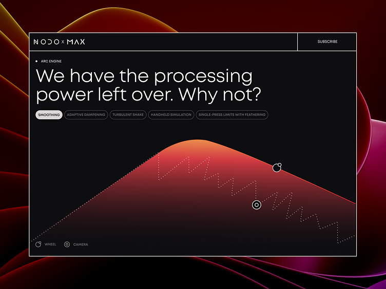
Visual design solutions for NODO Film Systems | Lazarev.
🎬 Scene 2. Take 1
Glad to be back with the NODO interactive promo page UI & UX design.
These three snapshots really capture our design philosophy: it's the little details that make a big difference. This project is packed with those small, yet crucial design elements. So, let’s take a closer look at them.
1️⃣ We've used animated graphics to make it crystal clear how the wheel interacts with the camera, showcasing the incredible effects it can create. We wanted to ensure users understand precisely what this product can do.
2️⃣ Our design team employed strong visuals and persuasive copy to highlight the benefits of the Inertia Wheels MAX, introducing viewers to its exceptional features and inspiring them to see the product in action.
3️⃣ Speaking of the product delivery schedule, we've showcased it through an interactive roadmap that progresses as you scroll. It's all about making things easy to understand and navigate.


