Day 10: Monogram

This is Day Ten of Thirty Days of Logos, in which I share a new logo idea for my design studio, Wildfire Studios, every day for 30 days.
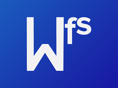
This was my attempt at a monogram: something I could stamp onto an envelope or letterhead and feel good about, but also something that captured the playfulness and attention to detail of my studio. It didn't turn out how I envisioned it in my mind (what does, really), but it's not horrible either.
What I learned from Day 10 is that I really like circles. I've experimented with other forms and will continue to, but I love putting a logo in a circle. It gives the whole thing a defined beginning and ending without defining where it "begins" or "ends", because the nature of circles is to be infinite. Sort of like all our hopes for business, I suppose.
I don't like how the emphasis for this logo is on the S, which is the least important part of the name "Wildfire Studios" in my mind. (Its shorthand for me has always been Wildfire.)
For those curious: the S is based on Proxima Nova and the W and F are from Bauhaus 93.