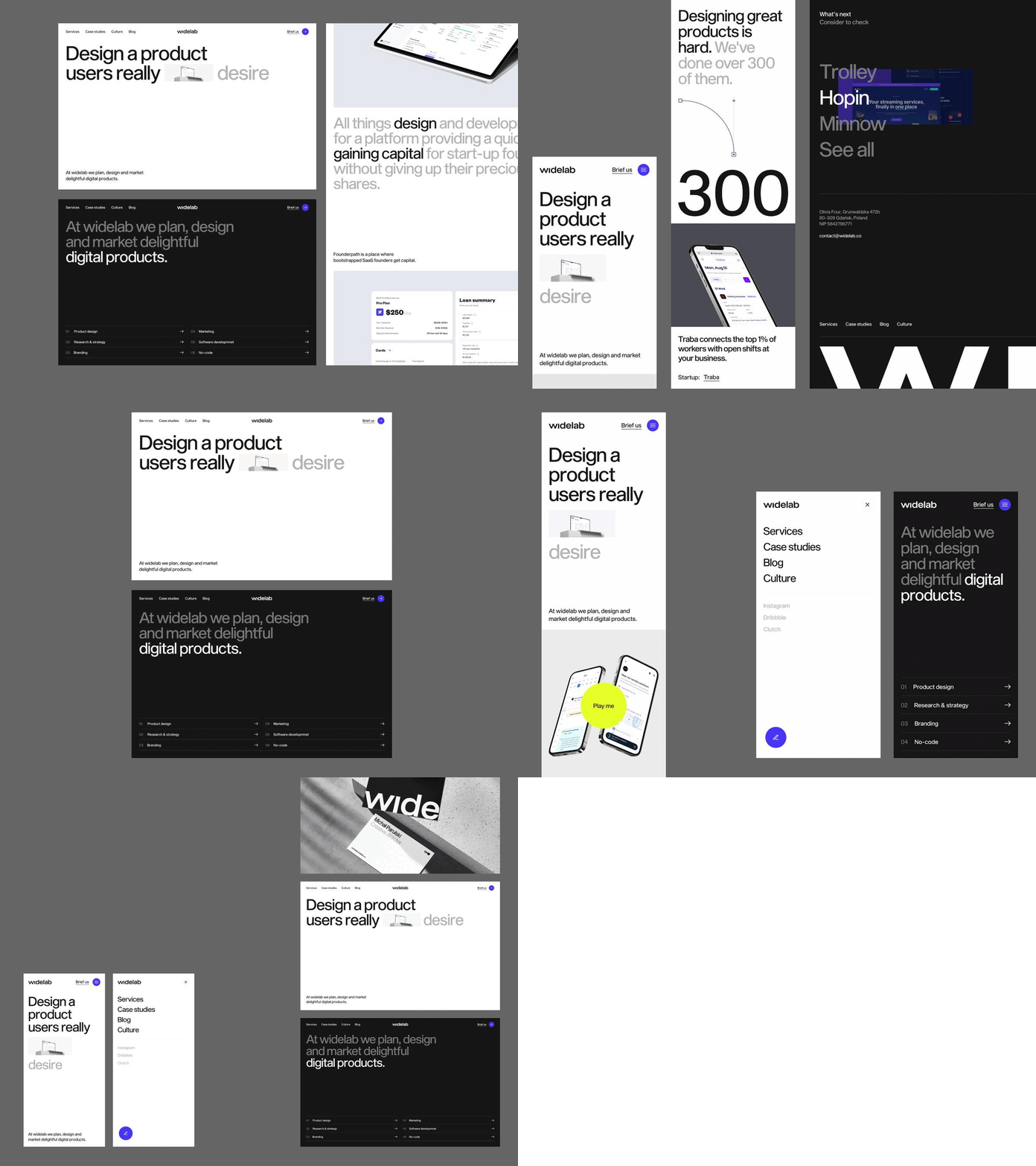
Widelab.co - Website
Case study:
Get ready for the wide!
Six years after the foundation of Widelab, it is time to redefine our identity. This is not a revolution, but a continuation, an update, because from the beginning we have been guided by the same values.
The new identity is to be the background, because it is our projects and clients that create our image and play the main roles. The brand feeling remains friendly and playful, but at the same time we wanted to make it clear that our partners can feel safe.
However, we do not want to be an invisible background, so we use strong but simple visual with typographic accents and focus heavily on motion.
We aim to execute interesting and innovative projects for thriving scaleups, collaborating with individuals who share our values: proactivity, empathy, and a design-driven approach. Through this, we will continue to build a stable and profitable company where everyone feels valued and fulfilled.
Art Direction: Michał Parulski
Lead designer: Grzegorz Leśniewicz
Logo: Kuba Enzowski, Natalia Żerko
Brand guidelines: Grzegorz Leśniewicz
Landing: Grzegorz Leśniewicz, Piotr Kaźmierczak, Rafał Olbromski
Development: Ryszard Czernik
Motion: Leszek Jańczyk
Photo: Jacek Margol, Sylwester Ciszek
Visit our team profile!
More stuff coming soon!
Do you need some help?
Send us a message: contact@widelab.co
---
Read more about Widelab and review full case studies:


