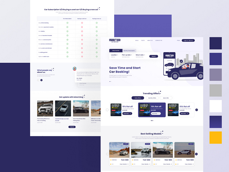
MyChoize's | Rental Car Website | User Experience (UI/UX)
MyChoize aimed to simplify the booking process to reduce user frustration and improve conversion rates. redesigned the booking website.
.
Let me know your Awesome Feedback Don't forget to Like❤ it
Share and like the post to support my work 😊😇
.
💯 We're available for new projects. Drop us a line at sakshiagrawal9011@gmail.com
.
WireFrame
User Interface Design
a. Streamline the booking process for quicker and more intuitive reservations.
b.Improve website and app loading times to enhance user engagement.
c. Enhance personalization features to make MyChoize customers feel valued and catered to.
d. Increase conversion rates and overall customer satisfaction.
Mobile App UI Design
Slow load times were a major concern for MyChoize users. To address this issue, we:Optimized website and app performance by compressing images, leveraging content delivery networks (CDNs), and minimizing code.Implemented lazy loading for images and ensured efficient server response times to expedite page rendering.Regularly monitored and analyzed load times to maintain a responsive platform.


