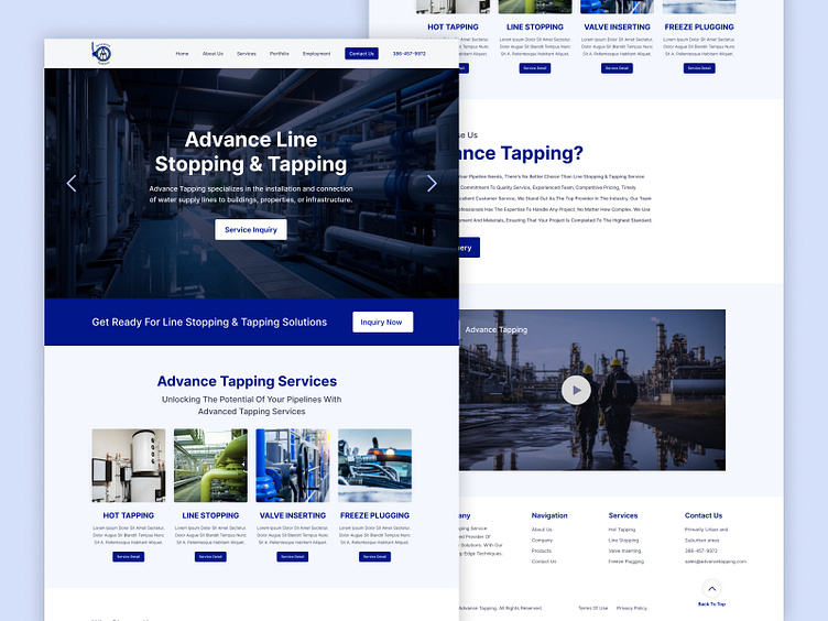
Website Design for a Line Stopping & Tapping
Organization name:
Advance Tapping
Description of the organization and its target audience:
Advance Tapping specializes in the installation and connection of water supply lines to buildings, properties, or infrastructure. Services include hot tapping, line stopping, valve inserting, and freeze plugging.
Target Audience Below: -Age: 40-60
-Gender: Male
-Location: Primarily urban and suburban areas -Property developers, construction project managers, real estate investors
Industry:
Construction
Style/theme ideas:
Professional and modern: As a professional service company, the website should have a professional and modern look and feel, using a clean and easy-to-navigate layout with a consistent color scheme and typography. We look like scrolling images in the hero image area.
Visual appeal: Including high-quality images and videos of projects or equipment that demonstrate the company's expertise and services can be visually appealing and help to establish credibility.
Clear and concise: The website should have clear and concise content, avoiding jargon or technical terms that may not be understood by the target audience. Providing easy-to-understand descriptions of services and processes can help establish trust and make the information more accessible.
User-friendly: A user-friendly website that is easy to navigate and search will provide a positive experience for users, helping them to find the information they need quickly and efficiently.
Mobile-friendly: With an increasing number of users accessing the internet through mobile devices, having a mobile-friendly website is essential for accessibility and user experience.
Brand identity: Incorporating the company's logo, color scheme, and other brand elements into the website design can help establish a strong brand identity and increase brand recognition.
Overall, the website design for Advance Tapping should aim to convey professionalism, expertise, and credibility while also being visually appealing and user-friendly. The layout and organization.
Page descriptions:
Logo should be in top left corner. Phone number should be in top right corner.
You can use 386-457-9972 for now. Menu should be Home, About Us, Services, Portfolio, Employment, Contact Us Please only use Google Fonts.
What to avoid:
Their colors are black and green.


