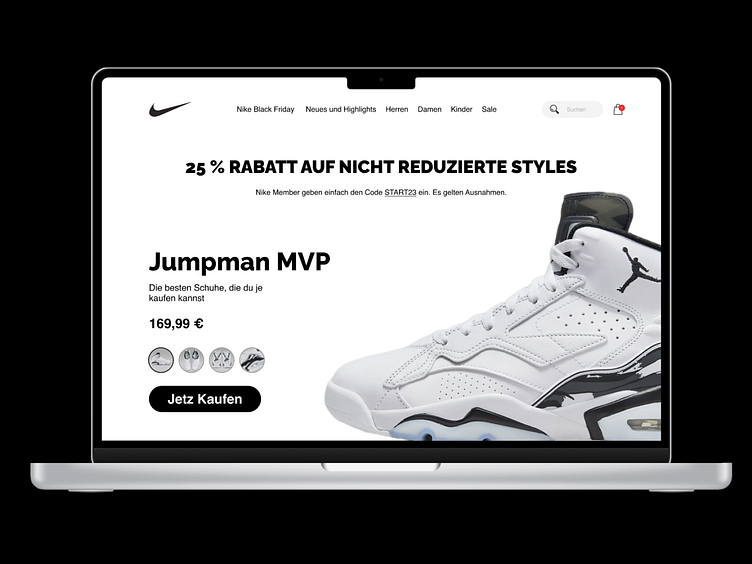
Nike Jumpman MVP Landing page
Concept Landing page for Nike Jumpman.
Here i tried to work with minimal design by just using minimalistic colors.
I focused mainly on UI as by UX point of view, so many things are missing.
Learning: Normally in UX culture we are promoted not to use pure black or white, but somehow with premium brands, pure colors work really good at giving the feeling of Luxury.
Connect with me:
More by Shuvam Sah View profile
Like


