BetterWithBabs Newsletter Design Process

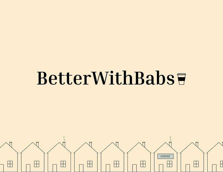
I designed a newsletter template for my husbands website. Check out my process!
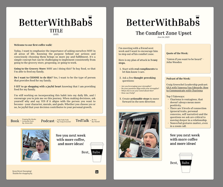
Iteration 1
Our first iteration below was too wordy and not formatted in a way that is engaging to the eye.
I usually delete newsletters that come through my email and I didn't want that to be the case for this newsletter!
I wanted BetterWithBabs to be one that users were excited to open each week because they could read the words on the page simply without being overwhelmed by a lot of information.
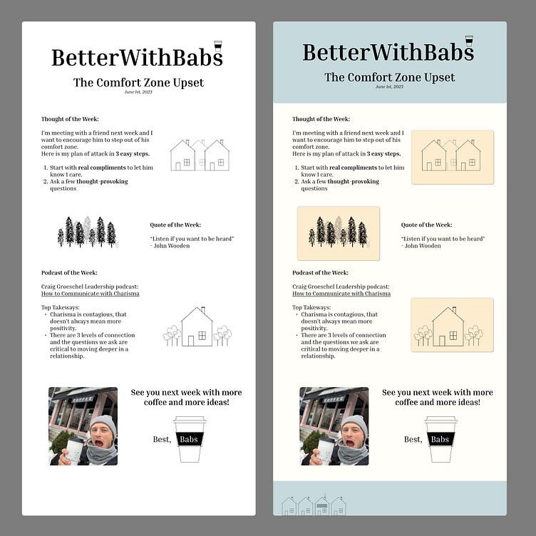
Iteration 2
The iteration below on the left is just plain boring!
I thought less color would make it simpler....I was wrong.
The iteration on the right is closer....I liked the color placement and doodles.
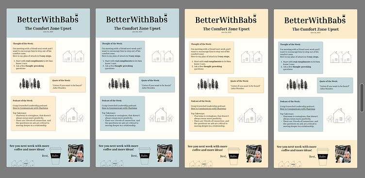
Iteration 3
These pictures below show my color quandary...I was trying yo figure out which colors placed where would engage the eye most and make the newsletter easier to read.
Iteration 4
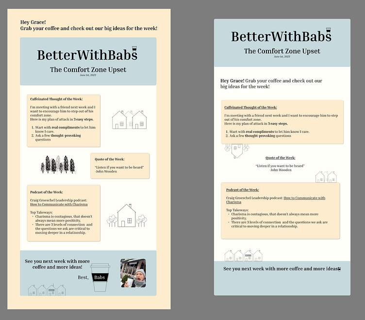
On the left below was a potentilal format of how the newsletter would look in an email. I didn't like how the greeting "Hey Grace! Grab your coffee..." was outside of the main page. It didn't catch the eye enough.
Finally we're getting somewhere!
On the right below is our final design. Goldilocks found her "perfect soup."
Click here to sign up and see a BetterWithBabs newsletter live in action in your inbox every Tuesday!