Mod
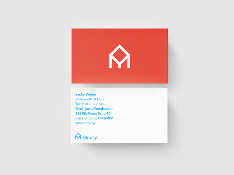
Dead logo for an interior design startup. The mark is supposed to place an "M" in the silhouette of a traditional house shape. Some claim they see a pencil too, but I think they are just seeing things.
More by Sean Weber View profile
Like
