packaging design

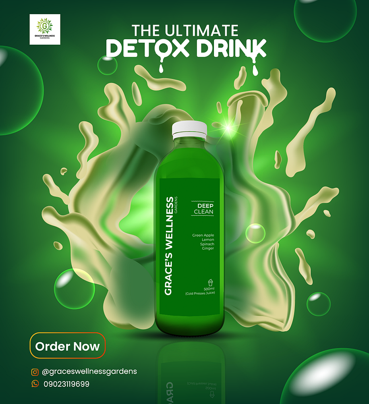
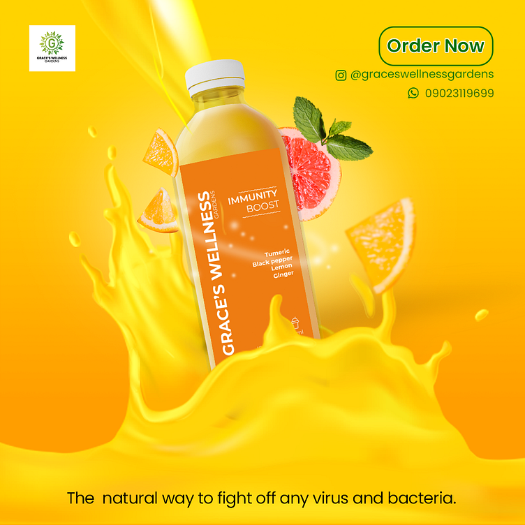
Conceptualization: The design process began with a thorough understanding of the client's brand identity and the unique selling points of their herbal juices. A key emphasis was placed on conveying the natural, healthy, and rejuvenating aspects of the product.
Research: Extensive research into herbal elements, botanical illustrations, and color psychology was conducted. This phase involved identifying herbs used in the juices and exploring design elements that would evoke a sense of freshness and wellness.
Brand Consistency: Ensuring alignment with the overall brand identity, the packaging design incorporated existing brand colors and fonts. Consistency was crucial to maintain recognizability across different product lines.
Typography and Imagery: Carefully selected typography emphasized the organic and handcrafted nature of the herbal juices. High-resolution images of the herbs were integrated to provide a visual representation of the product's natural ingredients.
Color Palette: A harmonious color palette was chosen, with vibrant greens to symbolize freshness, and earthy tones to evoke a connection to nature. The color choices aimed to stand out on shelves while reflecting the product's herbal essence.
Sustainability Considerations: To align with modern consumer values, eco-friendly packaging materials were explored. Emphasizing recyclability and sustainability, the design conveyed the brand's commitment to environmental consciousness.
User Experience: The packaging design was structured to provide a seamless user experience. Clear and concise information about the herbs' benefits, usage suggestions, and nutritional content was strategically placed for easy readability.
Mock-ups and Iterations: Several rounds of mock-ups and design iterations were created to visualize how the packaging would appear in real-world scenarios. Feedback from stakeholders and potential customers was invaluable in refining the design.
Finalization: After thorough consideration of feedback and fine-tuning, the final packaging design was prepared, ready for production. Attention to detail, visual appeal, and alignment with the brand's story were paramount in the finalization process.