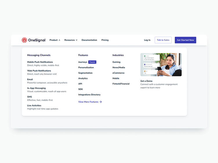
OneSignal Website Navigation
Website navigation improvements recently shipped 🚢
Project Goals
Improve Get a Demo (Contact Us Page) conversions
Drive more traffic to the page + get more form submissions from qualified users
Nudge users to high value pages (e.g. Journeys) by making them more prominent
Improve content hierarchy and scannability to make it easier and faster for users to get to where they want to go
What's New
Capabilities renamed to Products , which was the standard label used across most other sites we looked at
Company nav item (incl. dropdown) removed since it's not directly related to project goals. Nav dropdown items will still be accessible through the footer.
Prominent action button for Get a Demo at the top right, which led to 238% more Get a Demo page views + 20% more form submissions than our previous design without the button during a recent A/B test.
Get a Demo also called out within nav dropdowns
Popular badge added to nav items we want to drive more traffic to (e.g. Journeys)
