UX Library Logo Update

About the Project
This is a logo redesign that I did for UXLibrary.org, a one-stop website for UX resources, tools, and articles that I founded in early 2019.
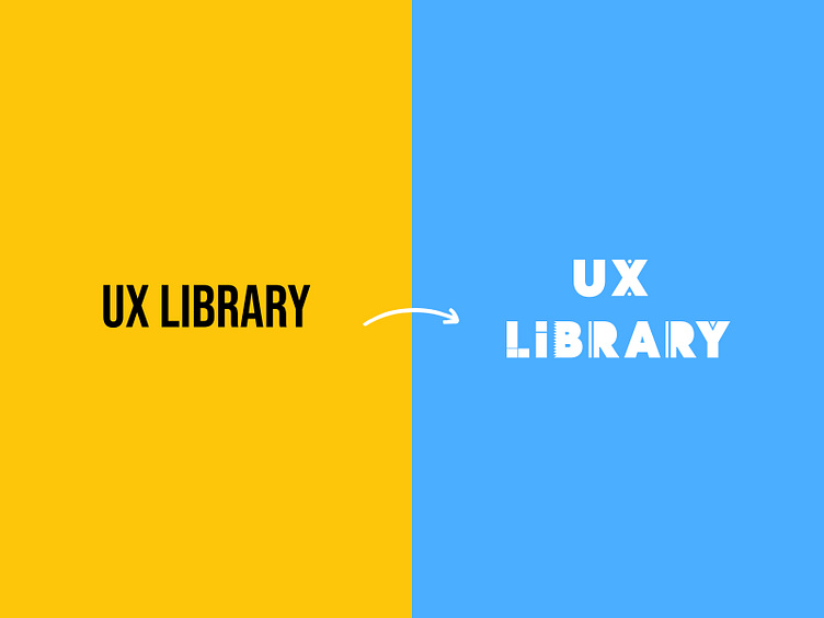
At the time of founding, I knew I wanted our website to have a word mark style logo (similar to Google, FedEx, etc.). But I put very little thought into using accessible colors. I just selected my favorite font at the time ("Bebas Neue") and slapped it onto a yellow background and called it a day.
A steady increase in website traffic encouraged me to give a serious stab at rebranding us this time with 2 goals in mind:
Incorporating a design motif or artifact and theme into the logo while retaining the wordmark style logo
Using a more accessible color like blue or purple
Below is a look at the results along with some of the early iterations I began to explore.
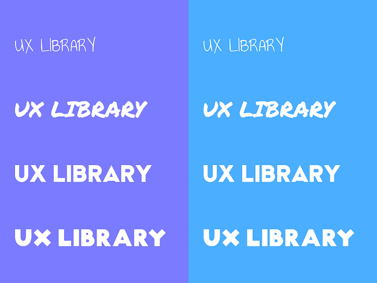
A Peek into some of my early iterations
I initially started with a handwritten style font style to represent the sketching side of designing but believed that aesthetic would not be matched by the rest of the website we had put together. Hence I moved to a more geometric direction for our logo.
Final Results