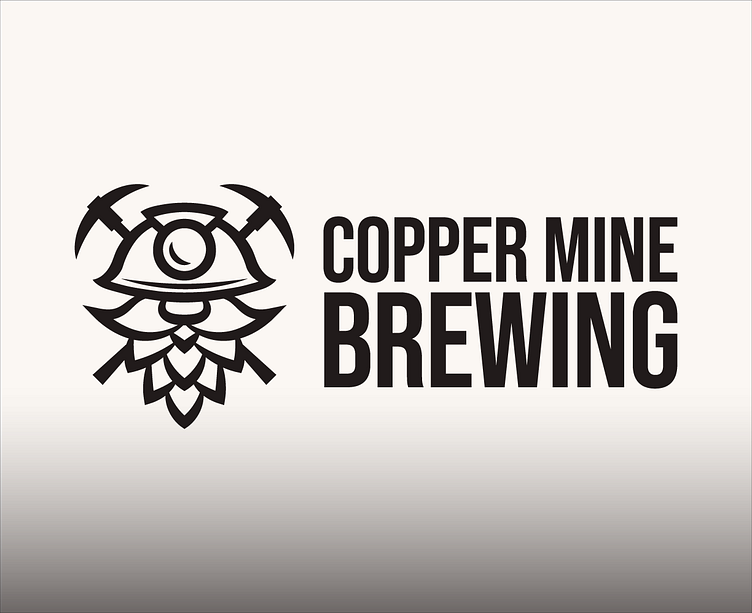
Brewery Logo: Miner + Hops (Rebrand)
Copper Mine Brewing Company is a small local craft brewery. They kick started their brewery in 2016 after brewing beer in their backyard as a hobby. With the Tucson market being saturated in local craft beer, Copper Mine is looking to rebrand to compete with other local breweries and eventually start selling their beers on the shelve.
I started with creating a more professional logo while keeping the original ideas and look of their brand. I wanted Copper Mine’s local fans to still be able to recognize their favorite brewery, I was consistent with spacing ,stroke weights, no mismatch corners. I simplified in the right places and also curves the pickaxes so they ‘cirlce around’ the head of the character. I turned the basic hop into a more legible bearded miner but at the same time it stills feel more "hoppy".
Original:
Redesign:
I then created a menu layout that I felt would make a customer feel excited to try/order a beer. It establishes a strong visual hierarchy where the name of the brew is the most important. Numbering these beers will encourage new customers to want to try them all. All other information is easy to find and easy to read and underwent user testing to be certain. ⤵
Overall this redesign stays true to the original brand while grabbing the attention of new customers.
Please follow my new instagram: @reesordesign


