Valexin - Logo Design

Design style:
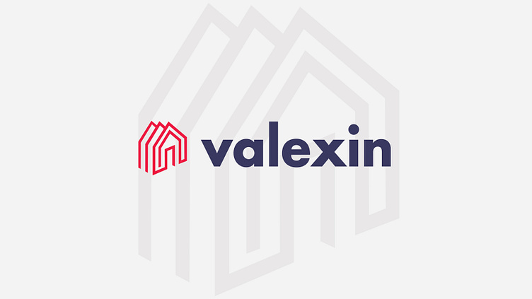
This logo presents a modern and clean design that uses geometric shapes and a sans serif font. The design style is suitable for their website that sells construction materials and other related products, as it conveys a sense of professionalism, reliability, and simplicity.
Symbolism:
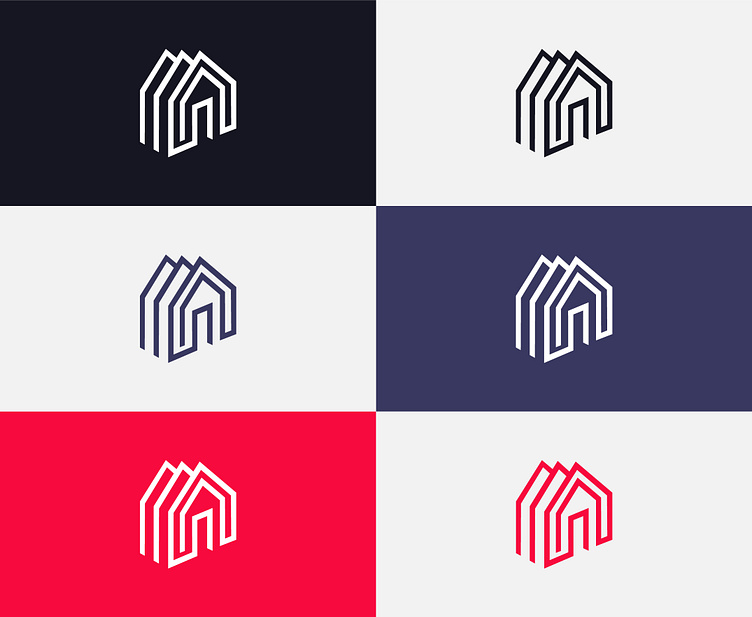
I designed a geometric shape type monogram that resembles a a building to symbolize the construction industry and the construction products that Valexin offers. This shape also suggests stability and strength, as it is made up of straight lines and sharp angles.
Color scheme:
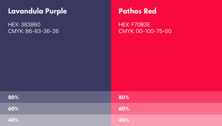
The logo uses a Pathos Red for the geometric shape, and a Lavandula Purple color for the word “valexin”. The red and white colors create a strong contrast and attract attention, while the purple color adds a touch of elegance and sophistication.
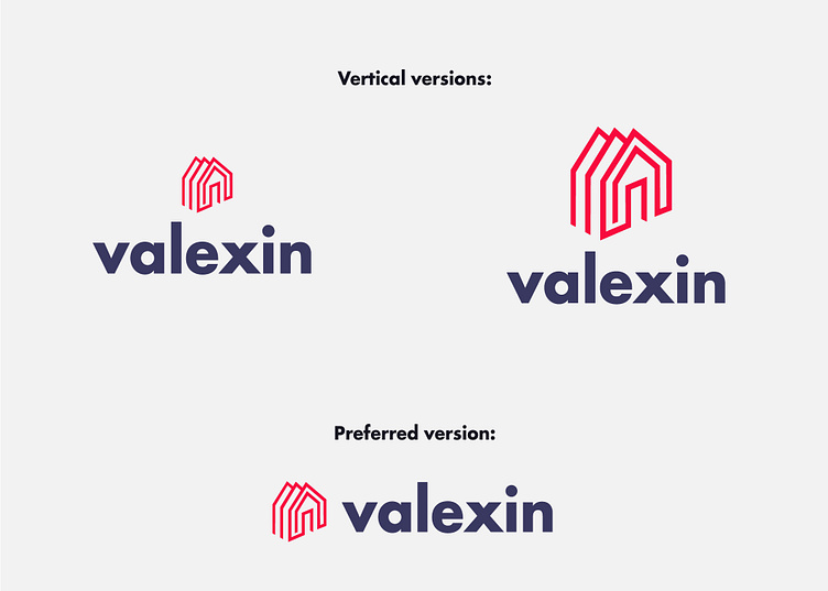
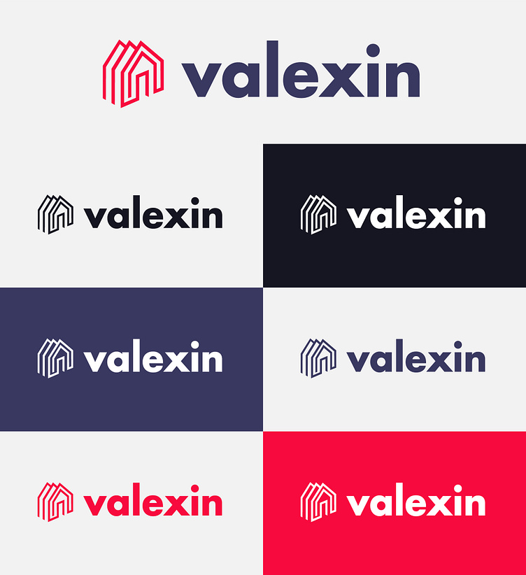
I strategically recommended the adoption of the horizontal version for their logo design, emphasizing its cleaner aesthetic. This choice was underpinned by a nuanced understanding of design principles, particularly the potential clash between the vertical house monogram and a vertically oriented logo.
I also believe this decision reflects my dedication to thoughtful design choices that transcend personal preference, aiming to enhance overall brand representation and leave a lasting impression on the target audience.
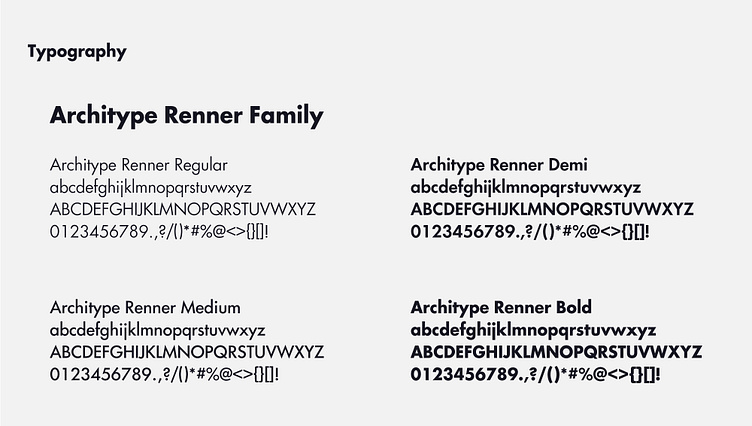
The word “valexin” is written in Architype Renner, which is a modern and professional sans serif font that complements the geometric shape and reflects the brand’s identity and values.