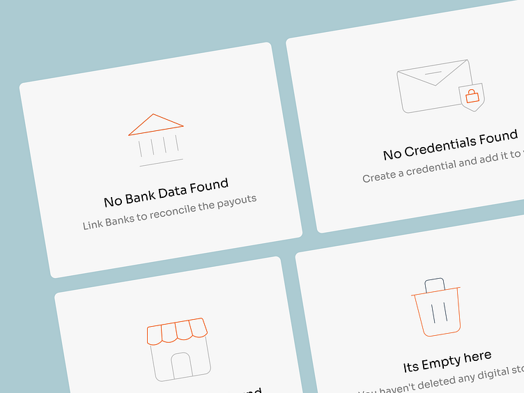
Engaging B2B SaaS Empty State Designs for Enhanced UX
Discover our collection of B2B SaaS empty state screens, meticulously crafted to guide and retain users during their zero-data moments. Our designs are not just placeholders but are integral to the user experience, encouraging interactions and providing clear calls-to-action. Optimized for both web and mobile platforms, these illustrations convey a friendly and professional tone, ensuring your SaaS product communicates effectively with its audience, even when the data is sparse. Dive in to explore how our empty states can add value to your business software.
More by Shebin Joseph View profile
Like

