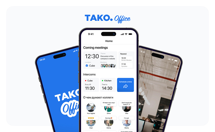
Tako.Office - App
Task
It became necessary to create our own product that would incorporate all the necessary services into a common ecosystem, including Google Docs, Trello and messengers (VK, Telegram and Whatsapp). The modernized workspace will be focused on specific processes in the company and integrated into the office (it will be possible to control smart appliances), which will improve employees comfort and reduce time spent on searching for and interacting with necessary documents and tasks.
Result
It was decided to Implement the set tasks in the form of a mobile application, as the main problems solved by it are related to communication between managers, clients and designers, which in most cases takes place on a cell phone. But nevertheless, a web version of the service is planned in the future. The possibility of running the application on ARM-based Apple computers is also envisioned
App structure
The structure reflects the sections of the application that are minimally necessary to realize the idea described above
So you can see:
Login section, consisting of a registration page and a login page. Employees of the company will use accounts pre-registered by the cis-admin. The application is an internal product of the company, and each employee will have an account when he/she comes to the company
Home - designed as a dashboard that includes blocks: schedule of employment negotiations, Cards with the statuses of colleagues for today (as in Direct in Insta), to lift your spirits and the nearest rallies for a particular person, with the theme, the number of participants in the time of the rally
Dialogs - a section where managers and designers can quickly access information from the dialog of a particular client, add new details to the task in Trello using keywords, sort clients into folders and find out from which messenger the dialog is being pulled to go to it if necessary
Profile - a section where each employee can see whose mentor he is or to whom he can turn for advice. Also their level and division
Key Screen Prototypes
Visual
When creating the design, I focused on HIG and Apple's design system of figs


