Toto: the dog walking app.
This is toto: a user-friendly mobile application that aims to simplify the process for pet owners to find a dependable pet care.
Brief
Research, strategize, and design a dog walking app that addresses today's challenges for pet owners, with a focus on creating an appealing and user-friendly interface.
My role
UX research, Product Design, Visual Design, Brand Identity
The challenge
Busy pet owners face the challenge of finding reliable pet care. Navigating through a cumbersome onboarding process and sifting through an overwhelming number of profiles contribute to decision fatigue as they seek trustworthy options.
The solution
Toto's solution streamlines the onboarding process and simplifies profile navigation, providing a user-friendly platform that ensures a quick and reliable selection of trustworthy pet care options.
Research & Define
For the research process, I explored both market analysis and interviews with pet owners to gain insights into effective strategies, pain points, and areas for innovation.
Market Analysis:
Explored a variety of pet care apps to understand industry benchmarks and standard features.
Evaluated existing products and services to identify strengths, weaknesses, and opportunities for improvement.
User Interviews:
Conducted one-on-one interviews with pet owners to learn about their experiences, preferences, and desired app features in pet care services.
Explored the challenges faced when finding reliable pet care and got valuable feedback on user pain points.
The Findings
By combining insights from existing apps and user's personal experiences, I was able to identify the main pain points.
User Personas
The research revealed pet owners' frustrations, goals, and ambitions, shaping the creation of personas. The personas were essential for understanding user needs and guiding decisions during the design process.
Ideation
User Flow
After identifying the key pain points, I designed the user flow with a focus on simplifying the onboarding and booking processes for pet owners.
Concept sketches
I started the design process by quickly sketching out ideas, creating foundational blueprints for layout and interaction.
Low fidelity wireframes
Building on the sketches, I created basic wireframes, focusing on core structure and functionality, allowing for early feedback before refining the details.
Visual Design & Branding
Toto's brand identity is energetic and bold, bringing cheer to the user experience. The typography is clean and versatile, ensuring clear communication and legibility. The result is a visually engaging and user-friendly design, reflecting Toto's fun and trustworthy personality.
Design & Features
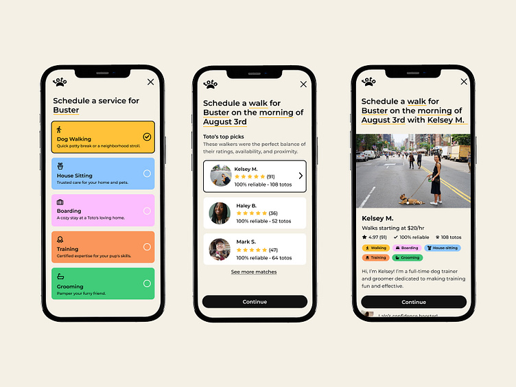
Simplified booking featuring an engaging storytelling progress style to keep users engaged and enhance the overall experience.
Personalized matches users receive their top three matches carefully curated based on availability, proximity, and ratings. This reduces the time users spend searching and vetting profiles, providing a quick and efficient way to find the most suitable caregivers.
Emphasized reliability on every walker profile with a reliability score, user ratings, and user reviews.
Takeaways
Reflecting on my journey in this process, I've gained valuable insights into product design. Understanding functionality, appreciating careful planning in the design process, and consistently considering user feedback have been pivotal. The process reinforced the importance of refining ideas early, aligning with the famous Frank Lloyd Wright quote, "You can use an eraser on the drafting table or a sledgehammer on the construction site."
While there are many steps I might have taken differently, each one in this journey contributed to my growth in product design.
Thank you!


