Clay UI
Overview
The Clay UI Figma project is a comprehensive resource meticulously crafted to expedite design workflows and ensure consistency across mockups. It offers a robust library of components and elements, streamlining the design process for fellow designers while upholding a cohesive design language.

Key Features:
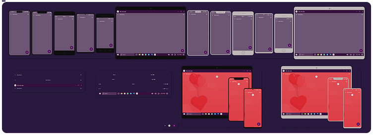
Extensive Component Library: Curated collection of UI components, including buttons, forms, navigation bars, and more, fostering faster mockup creation.
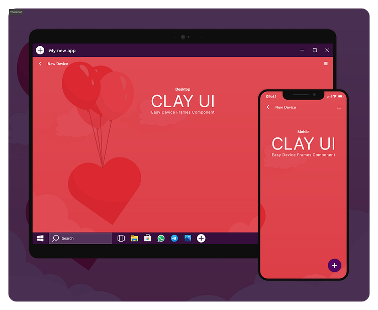
Responsive Design Elements: Adaptable components catering to various screen sizes, promoting scalability and consistency across different devices.
Customizable Styles: Defined styles and design tokens that enable easy customization, ensuring adherence to brand guidelines effortlessly.
Effortless Collaboration: Shared Figma project accessible to collaborators, facilitating teamwork and allowing designers to work seamlessly together.
Documentation & Guidelines: Comprehensive documentation outlining usage guidelines, ensuring uniformity in design implementations.

Design Process:
Research & Analysis: Conducted extensive research to identify common design needs and pain points among designers.
Component Definition: Created a robust library of reusable components, focusing on modularity and versatility to cater to diverse design requirements.
Iterative Refinement: Incorporated feedback from fellow designers, iteratively refining components to enhance usability and functionality.
Testing & Validation: Conducted usability tests to validate the usability and efficiency of the Clay UI Figma project, ensuring its effectiveness in accelerating design processes.
Outcome
The Clay UI Figma project has become an invaluable resource, empowering designers to expedite their workflows, maintain design consistency, and collaborate effectively. Its impact on streamlining the design process and fostering a unified design language has been widely appreciated by the design team.