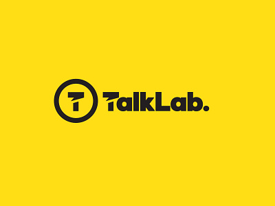
TalkLab Logo Design
One of a few initial thoughts for a new project called 'TalkLab.'
So yes I know the visual cliche of a speech bubble is one of the most overused ever, but I'm hoping this particular implementation is a little more refined, and integral.
Forming the 'talk box' as a the horizontal bar of the T hopefully gets me a little slack, or not.
Maybe I'm wrong, but I don't get a bad vibe when looking at it, and usually I would do as I'm so aware of visual clichés in logo design.
It could be that I don't need the separate circular logo mark at all when the wording is used, but just fall back on the circular version for social media and favicon etc. Thus this makes the stylised T a lot less focused on.
Or I'm just away with the fairies on this one…
More by Smitho.graphics℠ — Logo & Icon Design Studio View profile
Like

