Sprocket iOS Subscription Screenshot Redesign
7
for
Retrographic
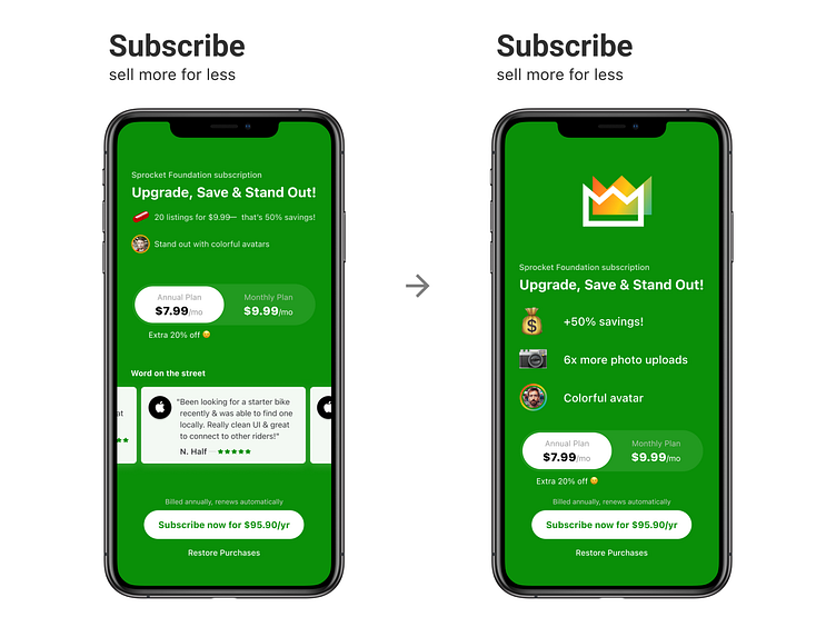
I redesigned the subscription screenshot as a part of moving it to the third position in the App Store lineup: icon changed from 💊to 👑, removed redundant review section ( since its already in the store UI ), added the more image perk, and made the perks section easier to read. Theres definetely still room for more improvements and what do you think?
If you like it, don't hesitate to click "L" 💗 or "F" + "Follow"
👇 Follow us and get the app now + review us 🌟
Sprocket Bicycle App on Android
Sprocket Bicycle Blog on Instagram
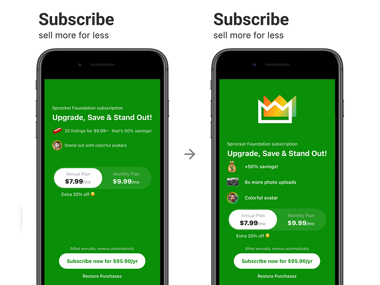
Smaller device screenshot redesign of the same thing