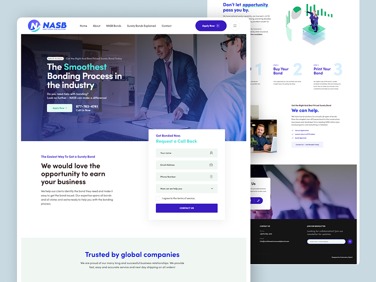
NASB Website Design - Home Page
The NASB website showcases a unique layout with off-canvas navigation, smooth transitions, and modern typography. It presents business information in a clean, organized manner with relevant links and full-screen sections. The site is simple, beautiful, and engaging, with easy-to-read, distraction-free content featuring an independent call to action on each page. The website layout is intelligently designed, featuring full-screen rows on the home page and innovative displays of data and information throughout. The use of a single font adds confidence to the design while NASB prioritizes content experience, focusing on ease, accessibility, and responsive design. Contemporary techniques like eye-catching animations and interactive slide shows with thumbnails are incorporated with large quotes and intriguing brand highlights that enhance the overall presentation and increase engagement. The front-end design combines a captivating blue and green color scheme with strong typography, leaving a memorable impression.
Like it?💗it.
We greatly appreciate your support and would love to hear your thoughts on this project.
Interested in partnering with us on your next project?
Send us a message, and let’s discuss how we can assist you. Drop us an email at projects@xclamatory.com if you would like to talk about creating a brand or a digital product.
More about us on xclamatory.com


