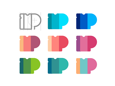
Passfold logo options
Hey there guys, how are you doing? It's so cold and gloomy outside, so I've decided to cheer you up with some bright colors. Here's one of my recent works on the Passfold project - I worked on logo and branding for it and wanted to share with you several version of the logo usage, involving different color schemes and approaches. Hope you like it, don't hesitate to press L, and share your thoughts in the comments.
I also feel it's important that you take a look at the case study on how this logo design process was unfolding - as usual it is described in one of the latest articles on the Tubik Studio blog. You might also be interested in reviewing a story of the overall UI/UX design for Passfold app. Check it out!
Stay tuned, stay inspired and have a great productive day everyone!

