Home Page Enhancements

Background:
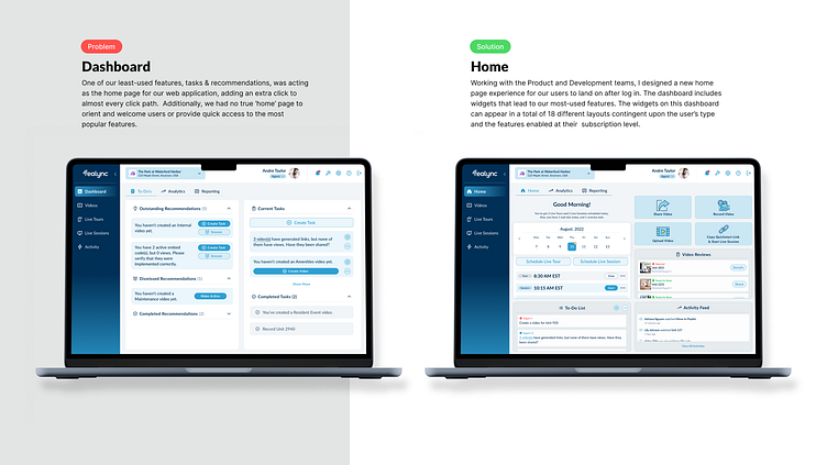
Working with the Product and Development teams, I designed a new home page experience for our users to land on after log in. The dashboard includes widgets that lead to our most-used features. The widgets on this dashboard can appear in a total of 18 different layouts contingent upon the user’s type and the features enabled at their subscription level.
Challenge:
One of our least-used features, tasks & recommendations, was acting as the home page for our web application, adding an extra click to almost every click path. Additionally, we had no true ‘home’ page to orient and welcome users or provide quick access to the most popular features.
Widgets to Include:
Greeting: The simplest widget is meant to welcome and orient users, and let them know if they have time-sensitive tours or to-do items to complete that day.
Live Tour Calendar: Our most time sensitive widget lives directly under the greeting, to allow for quick launch of scheduled tours.
To-Do List: Since to-do items are dated, it was a natural fit to place the list under the live tour calendar widget. It's also in the bottom row, since it's a lesser-used feature.
Quick Actions: In the top right, we've included quick access buttons to up to four features based on user type and subscription level.
Reviews: reviews
Activity Feed & Data Widgets: We also wanted to offer our users to be able to see how their content is performing at-a-glance, so we've incorporated a feed of recent prospect activity and visualizers for high-level performance statistics.
Solution:
Following an iterative design process, I created hi-fidelity screens and a clickable prototype for our development team to reference, based on the above requirements.
Implementation Process:
Wireframes: After the initial PRD was created, I created wireframes and iterated the ideal flow, as well as the 18 different possible user archetypes.
Hi-Fi: I then used Figma to create high fidelity screens to visualize the proposed new homepage.
Internal Feedback: The product manager and I then presented the updated design to a select group of internal teammates to gather feedback on the usability and effectiveness of the new features.
Refinement: I then finalized the design based on team insights, addressing concerns raised during the feedback phase.
Results:
More soon! This project is currently being developed. ☺️
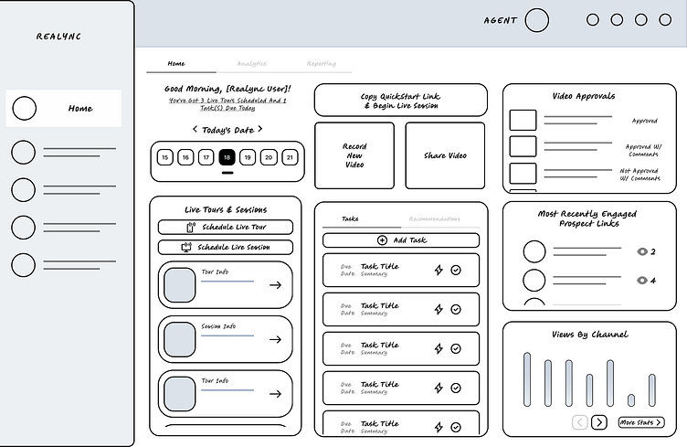
Initial Feature Wire Frame
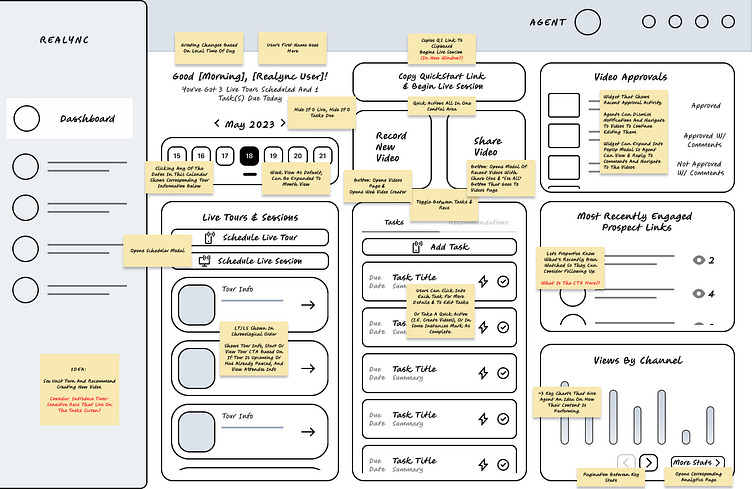
Initial Feature Wire Frame (Annotated)
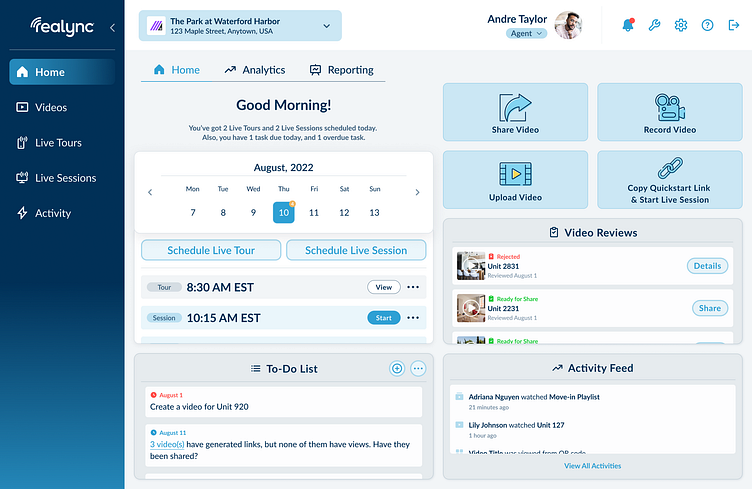
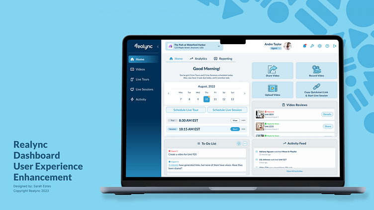
Final High Fidelity Screen (Agent User Type)
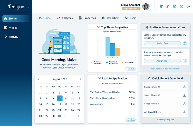
Final High Fidelity Screen (Corporate User Type)