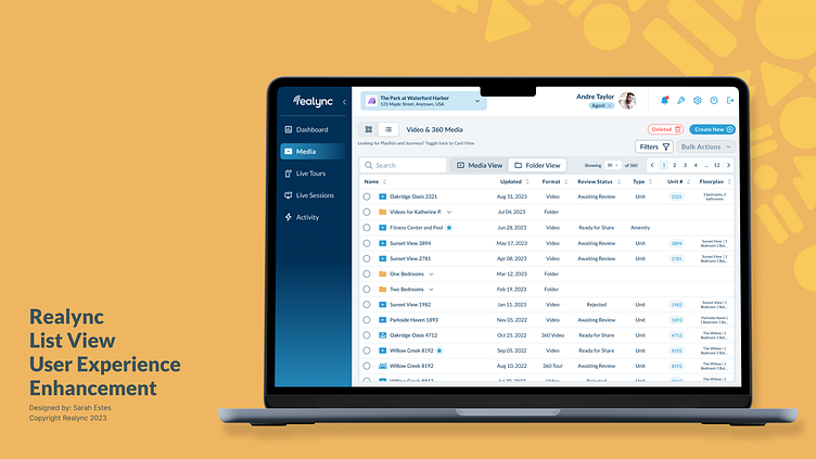
New Media Library List View Experience

Background:
The media viewing portion of our platform, initially designed with a card view interface, received feedback suggesting that users desired a more versatile and efficient way to interact with the content. The user feedback highlighted the need for an enhanced user experience allowing for more flexibility, quick actions, and improved content management.
Challenge:
Although this seemed like a simple addition on the surface, our various user and media types, along with a nesting folder hierarchy posed some challenges as we created a table within screen-width size constraints. So, we started by assessing the key features required in a Product Requirements Document (PRD).
Requirements:
List View Option: We introduced a new list view option alongside the existing card view. This will allow users to choose their preferred layout, providing a more customizable experience based on individual preferences.
Quick Actions on Hover: Recognizing the most popular interactions needed to be readily accessed, we implemented a set of quick actions that appear when hovering over a media item. Users will be able to perform the three most used actions; edit, share, and delete, without having to navigate through additional menus.
Multi-Select and Bulk Actions: To save users time and effort, we introduced the ability to select multiple items at once. Users will now be able to perform bulk actions, such as delete, move, or approve for syndication, streamlining their content management process.
Advanced Filtering Options: Understanding the importance of quickly locating media, we are adding new filtering capabilities. Users will now be able to filter results based on various criteria, allowing them to quickly find the content they've previously created.
Video/Folder Preview with Details. Due to sizing constraints, the new list view rows were likely not going to hold all of the information that users could previously see at-a-glance on card view. To make up for this, we needed to create a preview modal that allowed our users to see more details about a particular piece of media when it's column is clicked.
Solution:
Following an iterative design process, I created hi-fidelity screens and a clickable prototype for our development team to reference, based on the above requirements.
Implementation Process:
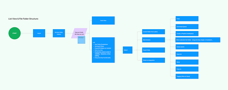
Click-Path: After the initial PRD was created, I led a discussion to determine the primary route through the new experience.
Prototyping: I then used Figma to create high fidelity screens and interactive prototypes to visualize and test the proposed design changes.
User Feedback: The product manager and I then presented the updated design to a select group of users to gather feedback on the usability and effectiveness of the new features.
Refinement: I then finalized the design based on user feedback, addressing concerns raised during the feedback phase. This included the addition of a view without folders/subfolders, and a new global sort feature for our Corporate and Manager user types.
Results:
More soon! This project is currently being developed. ☺️
Screenshot from Primary Click Path Workshop Session
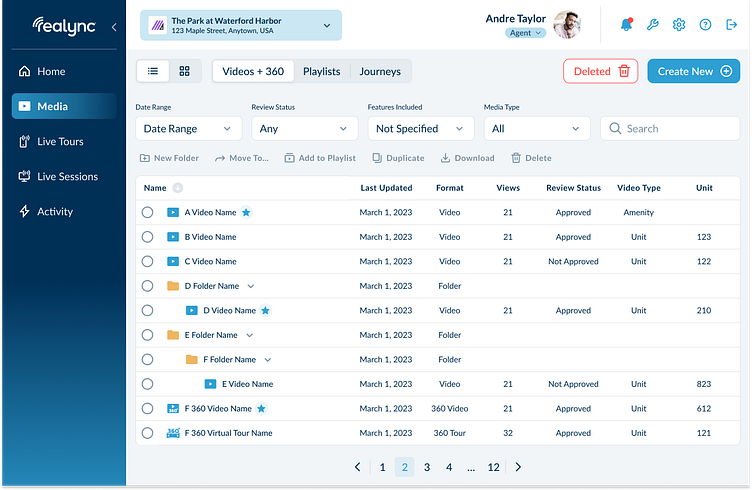
Hi-Fidelity Mock-up #1
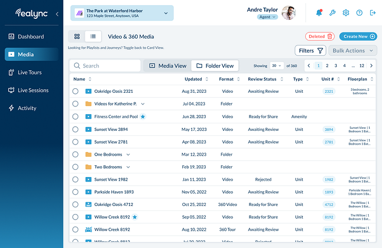
Hi-Fidelity Final Screenshot