Very Rebrand + Case Study
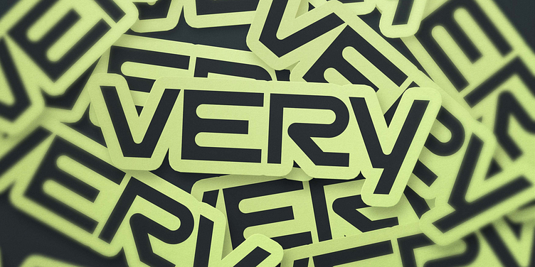
A short name is something to show off. We knew early on that we wanted to explore logotype-only styles for Very in order to make the most of its appeal and increase the name’s awareness and equity. Our aim was to embody the brand’s perspective to invite the most interesting conundrums — and solve them. Very revels in what seemed impossible before.
Their logotype is custom built on the bones of the typeface TWK Everett — it is well grounded, but feels elevated by the “Y,” lifting the rest of the letterforms up from its platform. There’s a sense of endurance through the “V” and the “R” and confidence in both the casing and the sharpness of the letters. It feels opinionated, in a good way.
Check out the full case study: https://focuslab.agency/work/very
------
Looking for a brand agency? We would love to hear from you.
Email us: hello@focuslabllc.com

