Jobdone Logo and VIS Design

關於 Jobdone
Jobdone Enterprise 是一個專注在解決工程現場與場域維運相關議題的雲端平台。從營建到設備維運,Jobdone 協助您跨組織的串連起產業的上下游流程。
如果想了解更多相關資訊,歡迎上我們的官網:
About Jobdone
Jobdone Enterprise is a cloud platform that focuses on addressing issues related to on-site engineering and field maintenance. From construction to equipment operation, Jobdone helps connect processes across organizations in the industry.
If you would like to learn more, feel free to visit our official website:
Logo 設計概念
這次的設計需求是因為產品需要進行重構,其核心概念野從原本強調改善工地現場的溝通,進一步升級為「 串連起溝通的斷點 」。於是,在 Logo 設計上改變了打勾的方式,使用點與點連接起打勾符號,象徵溝通的串連。
Logo Design Concept
The design requirement for this project arose from the need to refactor the product. The core concept shifted from originally emphasizing improved communication on construction sites to a more advanced idea of "connecting communication breakpoints." Consequently, in the logo design, the checkmark was modified to connect dots, symbolizing the linkage of communication points.


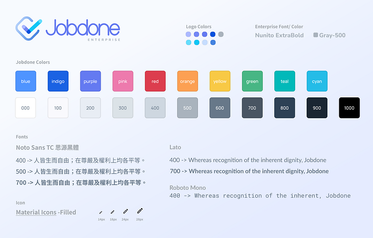
品牌視覺系統
顏色系統
藍色是被公認最適合生產工具的顏色,但也因此以藍色為主色的產品太多了,所以在選定主色時,為了做出差異化,選用了與藍色相近的紫色,並且以藍色作為輔色。其餘的色彩依照主色延伸,皆帶有一點藍色調。
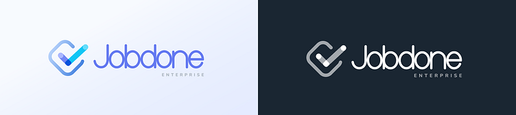
形狀設計
以打勾圖示為 Logo 的產品多以圓形作為外框,同樣為了有差異化,使用方形作為外框。而 Logo 與標準字保留原有圓潤的造型,維持親民的形象。
Guideline 字體與圖示選用
由於產品多用於網頁,並且以繁體中文為主,所以在字體的選擇並不多,使用開源的思源黑體,其搭配的英文字體為 Lato,等寬字體為 Roboto Mono。圖示使用 Google Material Icons(Filled)。
Brand Visual Identity System
Color System
Blue is universally recognized as the most suitable color for productivity tools. However, as many products use blue as their primary color, we opted for a shade of purple close to blue to establish differentiation, with blue serving as the secondary color. Other colors in the system are extensions of the primary color, all carrying a subtle blue undertone.
Shape Design
Products with a checkmark icon as the logo often use a circular frame. To create differentiation, we chose a square frame instead. The logo and standard font maintain their original rounded shapes, preserving a friendly and approachable image.
Guideline of Font and Icon Selection
As the product is primarily used on webpages and is focused on Traditional Chinese, font options are somewhat limited. We have chosen the open-source Source Han Sans for the Chinese characters, paired with Lato for English text and Roboto Mono for monospaced font. The icons are sourced from Google Material Icons (Filled).