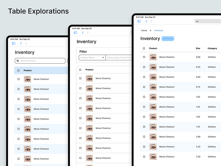
Inventory Table Explorations Design
Hai There 🖐🏻
I want to share one of my explorations on inventory table design.
The first design exploration is to make color a divider. With different colors on the row, the data is easy to distinguish in the eyes of the user. I'm using a color border for the stocks that are available, this allows users to quickly differentiate between existing and empty stock.
Borderline table, in this table I'm using a thin border line as a divider between one data and another. The Filter on this design is divided with a borderline. With this design, it looks more clean and plain.
Borderless design, a combination of the first table design with the second one. The borderless design makes the table plain and clean. To make it easier for users to see, I use a different color on the row.
Which table design is your favorites?
Share your answer in the comments 💬.
Press "L" if you like ❤️ it.
So do you have some ideas?
Contact me : work.pequo567@gmail.com
or you can check on Fiverr


