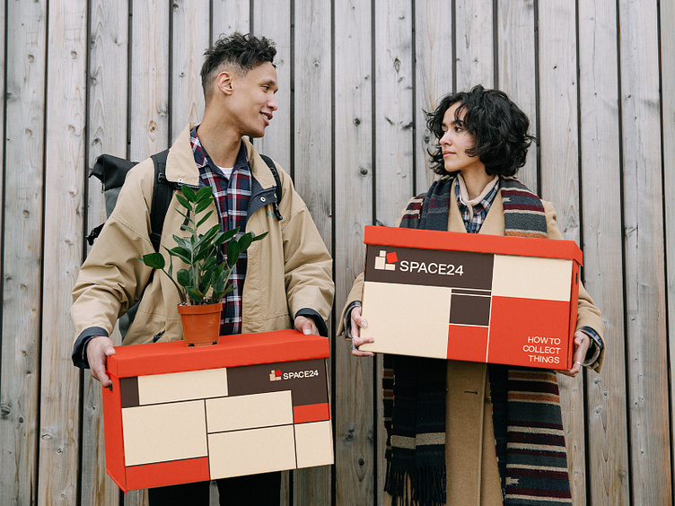
Storage branding SPACE 24
SPACE24
Task:
Developing of logo & identity
Project background:
SPACE24 is the largest modern and secure self-service storage facility in the Baltic States, providing more than 800 storage units to meet a wide range of needs of enterprises, households and students.
Idea:
Every one of us has been dealing with the problem of storing, putting away and collecting things. For example, some of us had to deal with moving and piles of boxes growing into a whole unstable mountain. Or returning from the countryside, always faced with the question of how to fit everything in the boot. Or after a big shopping trip to the shops, wondering about how to put everything into bags. Sometimes this turns into a whole puzzle or a whole quest. So for this concept, we’ve taken the image of a game of tetris as one of the prime examples of a puzzle game where you have to put everything to arrange everything. The elements of the puzzle pieces are squares. And they remind us of boxes.
The solution:
When developing the logo, we used boxes as a basis, as an attribute that is necessary for storing things. The main colors of the boxes in logotype were made in light beige, to create an association with moving boxes. However, the main box on the logo is a different color, which may change color depending on the country. The boxes themselves have geometric shapes consisting of a different number of square blocks, we laid them in horizontal lines without spaces, as we need to do
in the Tetris game.


