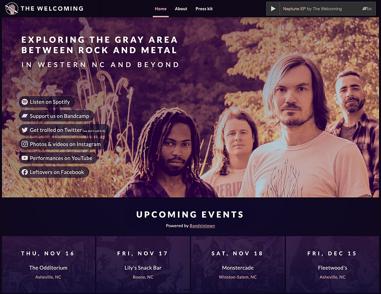
The Welcoming website
2 years into this band, I finally made us a real website. The upside is, we had plenty of time to gather plenty of beautiful photos, two albums, a bunch of quotes, decent Spotify numbers, and a handful of reviews and interviews.
I'm proud of how this turned out! I feel like I successfully injected a lot of personality into the copy writing. The image of our bassist with the phrase "Wow, this is really loud!" has sort of become our mascot and catchphrase, so I'm featuring that prominently in the footer. He's also the browser icon.
It's also super responsive. I did a bunch of tweaking even at big screens, ditching the centered tube of content for big full width sections. And I learned not to blindly set the height of a hero section to 100vh, because that can look really silly on modern flagship phones.
On the technical side, the events are pulled straight from our Bandsintown via their artist API. I'm using NextJS for this site so that was pretty painless! The choice of tech also means that the audio player keeps playing as you navigate to the different pages on the site.
Content wise, there's a lot here. It's only 3 pages but the press kit page especially is pretty dense.
