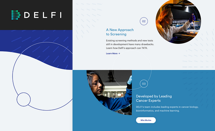
Delfi Diagnostics Site Redesign
Some exploration of new brand approaches and website layout options for Delfi Diagnostics, an ML-based cancer screening biotech firm. The marketing and executive team at Delfi wanted to reposition their website in line with competitors in the industry and bring the focus of their brand as a cutting-edge, science driven product to the forefront.
We took an approach that centered on molecular pattern and mutation for our underlying textural elements and imagery, creating organic, flowing shapes and transitions throughout the page layouts. The color system used evokes comfort and proficiency through the use of rich blue tones and cooler grays and whites. Our approach blended the organic and cellular with the more mechanical and methodological to create a confident, innovative brand that consumers and doctors alike could feel confident using.
Homepage Hero Options
A variety of final round Homepage options we presented to the client. Some focused more on large-scale photography or bright gradients to draw attention to the brand messaging.
Additional Proposed Page Layouts
We explored a range of approaches and formats for the content on the new website. We drew inspiration from healthcare technologies and data visualization to bring together the new brand vision for Delfi.
Pattern and Texture Exploration
Part of the new brand approach was to use patterns reminiscent of cells or medical device interfaces. These patterns helped to bridge content sections, imagery, and BG treatments.


