ChatGPT 3.5 Redesign
🚀 Exciting to dive into ChatGPT's latest UI & UX update today! 🌐 However, in my exploration, I've identified a few areas that be enhanced in the current version:
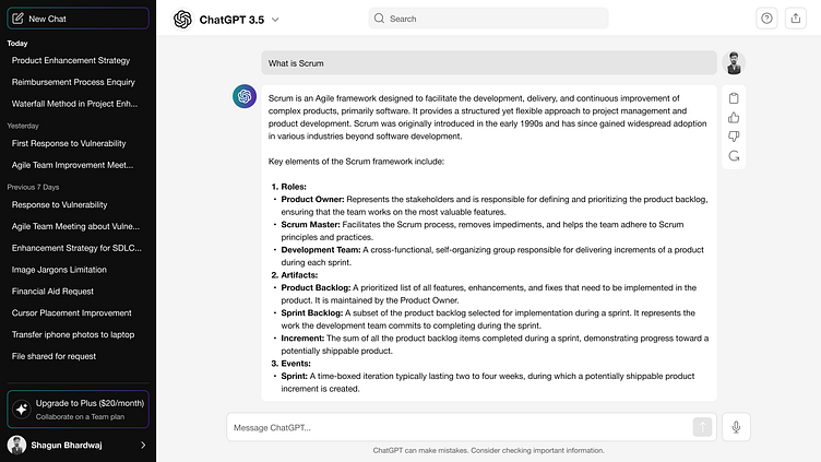
1️⃣ The new Chat Button on the left side appears to be a double entity, causing slight confusion in its functionality.
2️⃣ Accessibility is key! "Today," "Previous 7 Days," and "Previous 30 Days" lack the desired contrast as per WCAG standards, affecting user readability.
.3️⃣ More Options (Three dots) now appear after selecting a chat from the recents list instead of on hover.
4️⃣ Noticed a missing separation between Recent Chats and the Upgrade section, suggesting a need for a clearer visual distinction.
5️⃣ The visual separation between user queries/text and ChatGPT's results could be more prominent.
6️⃣ Clicking on "Regenerate" reveals an arrow to move to the previous result. It might be challenging for users who wish to compare both results.
Note : I've included the image of my solution in this post.
Your feedback matters, and I believe these refinements can elevate the overall user experience. Looking forward to witnessing the evolution! 👩💻🚀 #UXFeedback #ChatGPT #UserExperience #FeedbackLoop #UI #UX #AI#openai
