Casa Cugireana - iOS App ReDesign

From the clean rounded edges framing buttons and cards to the seamless navigation experience crafted through purposeful iconography, explore a design narrative rooted in precision and functionality.
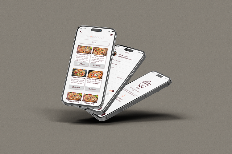
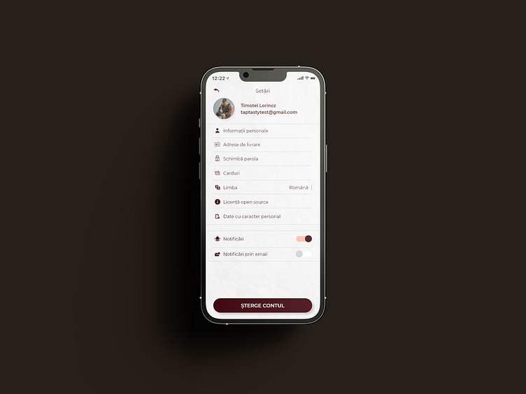
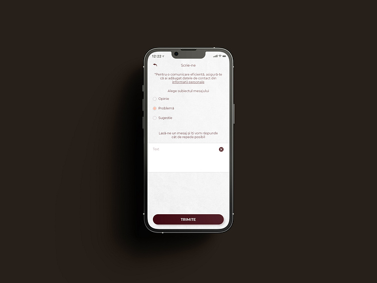
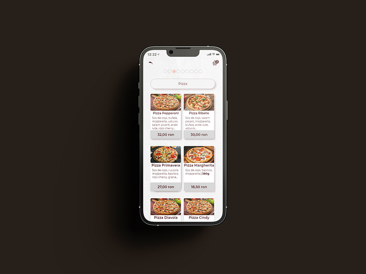
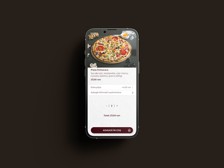
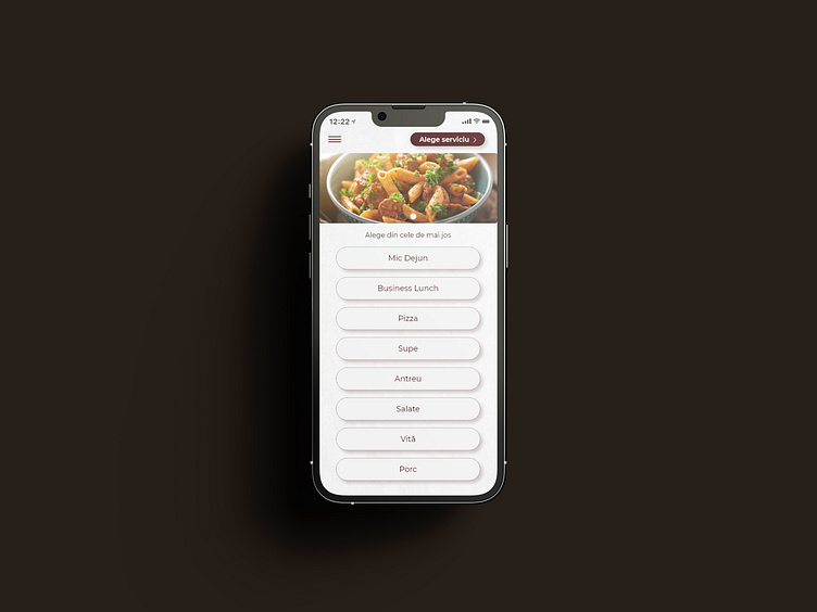
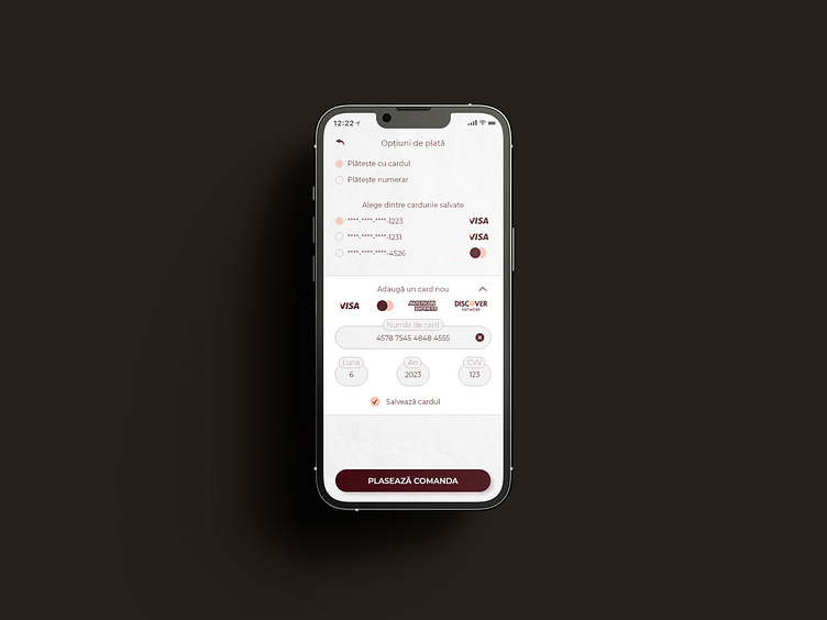
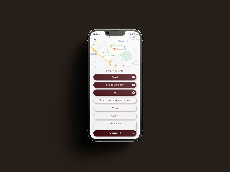
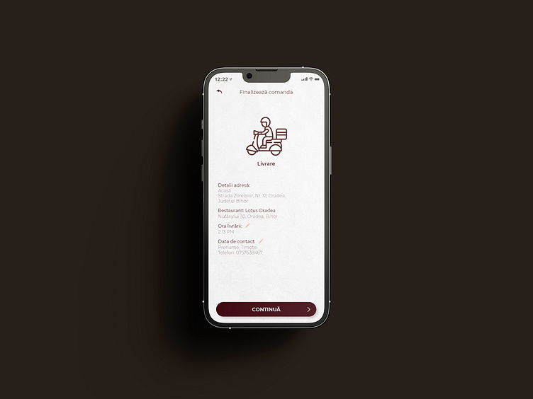
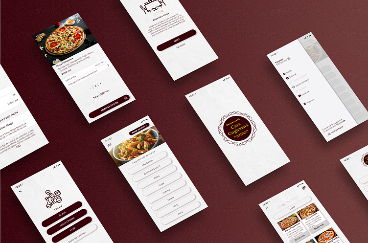
In shaping this mobile app, I've anchored the design in a core principle – the embrace of clean rounded edges. These aren't just stylistic choices; they're the tactile foundation of user interaction. From buttons to cards and every navigational element in between, I've purposefully applied these rounded edges to ensure an intuitive journey through the app. This deliberate approach extends beyond aesthetics; it's about creating a cohesive visual story that aligns with the user's natural flow.
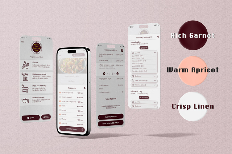
Color Palette Dynamics:
Rich Garnet (#39000a):
Fonts: A bold and inviting choice, ensuring legibility while infusing a sense of warmth into textual elements.
Buttons Background & Border Color: The deep crimson hue establishes a commanding presence, guiding users seamlessly through interactive elements.
Icons: Embracing the essence of tradition, icons adorned in Rich Garnet carry a sense of culinary heritage.
Warm Apricot (#ffbaa6):
Highlights: Applied strategically to draw attention to key features, offering a comforting glow that complements the app's culinary focus.
Bullet Icons & Certain Texts: Infusing a touch of warmth, creating visual interest without overpowering the overall aesthetic.
Crisp Linen (#f1f1f1):
Text Area Backgrounds & Other Elements: Serving as a clean canvas, enhancing readability and providing a sense of purity. The neutral backdrop allows content to shine while maintaining a modern, polished look.