Royalsmile | Logo + Brandbook
About Royalsmile 🔥
Royalsmile is a youthful and stylish brand of teeth whitening products offering innovative strips and solutions based on PAP without hydrogen peroxide. They're safe, FDA-approved, and mindful of enamel preservation, creating bright smiles effortlessly.
This brand embodies the archetype of the "Magician," infusing a sense of wonder, confidence, and a positive attitude into the care for a healthy smile.
Task ⚡️
While creating Royalsmile whitening strips, the focus was on crafting a bold corporate style that reflects the innovative product concept, revolutionizing the approach to teeth whitening. Confident choices in color palettes, fonts, and a minimalist logo were employed throughout the development process to create a unified and recognizable brand identity.
My Approach 🚀
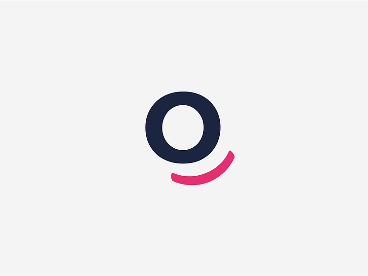
The logo concept entails combining a classic text style with a bracket underneath the letter "O," symbolizing a smile, emphasizing the joy and aesthetics of a dazzling white smile.
It was important to move away from the commonplace use of a tooth symbol in teeth-related products, so I focused on the smile, as the product implies achieving a beautiful smile effect after using the whitening strips.


