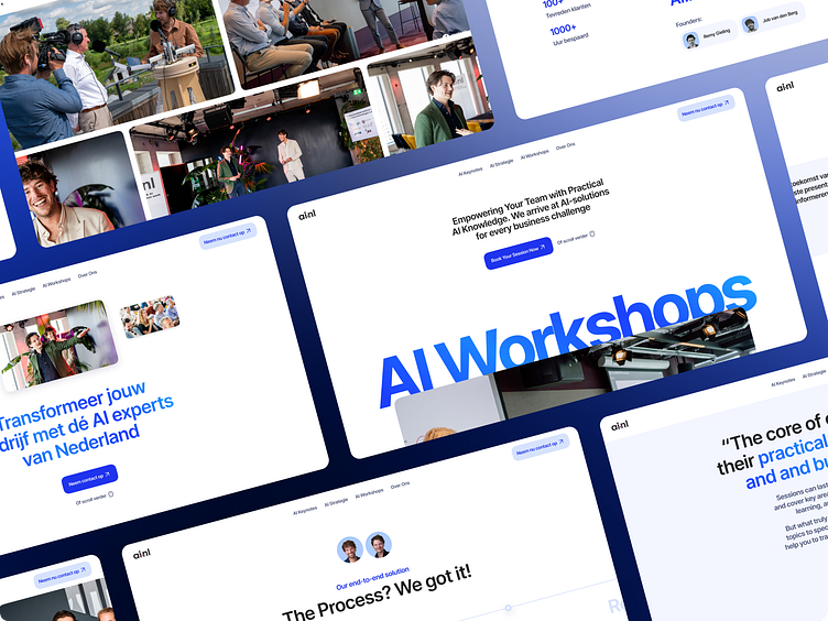
AI.nl web design/development
In the fast-evolving world of artificial intelligence, the AI Group had managed to blaze a trail in only a few years, but they recognized that their digital environment needed an upgrade to match their cutting-edge services. The Founders approached Noco with a vision to revolutionize their online identity. Our team, passionate about collaborating with forward-thinking companies driving technological change, was thrilled to hop on this transformative journey with AI.nl.
Our Approach
AI.nl's objectives were clear: hop on a rebranding journey, infusing modernity and user-friendliness while steering clear of the cliché futuristic look. Instead, the focus should be on the human interactions that make up most of the work done in one of their projects. The goal was to craft a website that engaged visitors and invited them to explore AI.nl's extensive service portfolio. Our focus? Crafting a website that genuinely reflected AI.nl's role in the AI consulting landscape, in both design and content, and turned it into an optimized conversion machine for their diverse audience.
Our Approach
Our mission for AI.nl was straightforward yet impactful: design a website that engages visitors and invites them to delve into AI.nl's services. Here's how we made it happen:
Rebranding for Differentiation: We redefined AI.nl's identity, distancing it from the typical futuristic aesthetic. We introduced a fitting color palette, typeface, and visual elements that gave AI.nl a unique look aligned with their brand and appealing to their target audience.
Precise Communication: Effectively showcasing the diverse range of services, from keynotes to workshops and strategy sessions, to a broad audience.
Optimizing Conversions for a Diverse Audience: Our goal was to optimize the website for a wide spectrum of users, including event managers, workshop hosts, decision-makers, data directors, media agencies, professionals, and businessmen. This was achieved through strategic calls-to-action and content placements.
Strategic CTAs: We strategically placed clear and compelling calls-to-action throughout the website, tailored to different target groups, creating a seamless user engagement.
Data-Backed Content Integration: We integrated impactful statistics and client testimonials to enhance credibility and prominently showcase AI.nl's accomplishments.
Research
To enrich our approach, we conducted various research activities and embraced several design principles:
Visual Research: Insights from visual research, inspired by successful tech websites that resonate with their audience.
Minimalistic Design Focus: A minimalist approach ensured that design elements took a back seat, allowing content to shine and guaranteeing a smooth user experience.
Personal Touch: By showcasing the faces of AI.nl co-founders, we humanized the services, forging a deeper connection with the audience.


