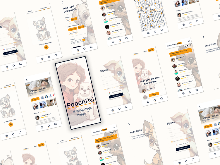
PoochPal - Making Dogs Happy
Over 65 million American families own a dog.
But life gets hectic and before you know it, the dog hasn’t had a walk in over a month. You know your dog needs the exercise and fresh air, but how to squeeze the time into your busy schedule?
Meet PoochPal, the app that walks your dog for you with the security of trained, vetted dog lovers, without the headache of clunky coordination and trust issues.
As a student of Dribbble’s Product Design Academy, my first assignment was to create a dog walking app. The goal was to make it easy to use and closely aligned with the users’ goals and pain points.
Market research
I started with competitive research to see what the existing dog walking apps have to offer and what can be improved. I found that the apps offering a large array of services tend to be cluttered and hard to use, so I went with a one-task focused approach; the app would only include dog walking services.
I perceived from user interviews that people use these apps because they have full lives and are too busy to give their dog the proper care it needs. This told me I would need to make the app as easy to use as possible, making the booking process fast and stress-free.
Mapping the user's journey
I gave the user flow a most straight-forward path to booking a dog walk, while still giving the user a chance to get to know the walker first by messaging them in advance.
Crafting the wireframes
I did a quick sketch of different layout options based on my user flow and decided to go with a layout that is clean and includes lots of visuals, reducing the clutter and making the process feel quick and easy.
Choosing colors
I explored color palettes and fonts, ranging from earthy to playful to bold. I made the choice to go with a high contrast, fresh blue-orange scheme, the blue giving the user a sense of security with the orange adding a playful, relaxed energy.
Designing in high fidelity
The next step was applying the color palette to the wireframes, turning them into high fidelity screens. I also added high-detailed illustrations of dogs to play to the welcoming nature of the app.
Viewing the app in all sizes
Once I was confident with the way it looked, I added auto layout to my screens to make them viewable on any device.
Creating a mini design system
I created a library to store all my commonly used components and text, color and effect styles to keep the design elements consistent and easily reiterative.
Prototyping and testing
Next, I added interactions to make my prototype testable and realistic. After making small changes, the testers were able to accomplish the task of messaging a dog walker quite easily, showing me that my original user flow accomplished the feat of having the shortest possible route to the end goal.
Lessons learned
This project taught me that goals are important, it helps you make a solid plan and gives you a metric by which to measure your success.
And as someone who never owned a pet, learning about and empathizing with the user was critical, as creating the product based on my personal opinions would have led to an app that was way off the mark.
Lesson learned: trust the process, it will help you deliver your best work!


