Healthcare Assistant - PocketDoc
Create a medical assistant app for users to track their symptoms, medications and hormonal cycles.
Spotting the problem
Many people with hidden illnesses and difficult to track symptoms of disease or hormone imbalance have trouble finding relief from their health issues. Those who are seeking help often have trouble keeping track of what treatments they have tried, what dosage of medications helped or hindered progress, or even remembering what to take and when.
I was asked to make an app for women between the ages of 25-65 who want to get a grasp on their total health, including menstrual cycles, hormone replacement therapy and symptom tracking throughout their daily lives.
Pocket Doc aims to help everyday users learn what patterns, medications and general routines affect their daily health. Learning what medications and symptoms are related and what impact your daily routine has on your overall health can vastly improve quality of life.
No bones about it...
When I first start out on a project, I like to pull references from from the people who are already doing similar things, and doing them well. I then take those references and sketch out my own ideas to create some super simple screens to give me a solid launch point.
Fleshing it out
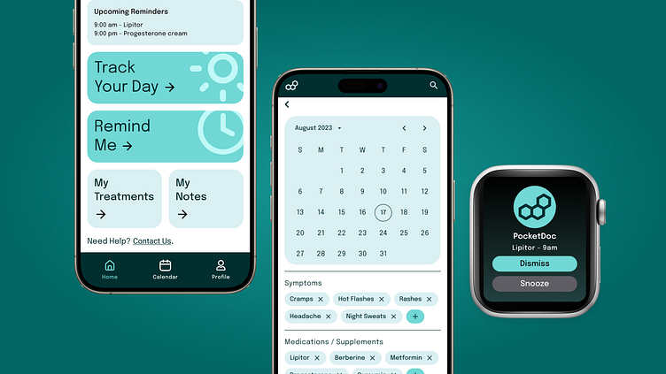
Let's take these sketches and make some lo-fi screens. At this point, the color scheme still hadn't been worked out, but I knew it was going to be cooler colors and probably incorporate light blues and purples. I also knew the dashboard was going to primarily be 4 large buttons to keep things simple for the user.
Getting up to speed
Since the primary objective for this app is to track daily health and remind users to take their medications and supplements, I needed to make sure these processes were straight forward and easy to find in the app. I tweaked the dashboard to make those 2 functions the most prominent and then fleshed out the reminders pages more.
With so many variations on medication timings, I wanted to make sure setting reminders was simple for the user, even if the medication required complex scheduling. I opted for a segmented button to select between daily, weekly, monthly or periodic reminders, which was a well received idea that test users seemed to understand quickly.
One of the biggest obstacles that stood out was the periodic reminder. Some treatments require medications or supplements to be taken only a set amount of days apart, a specific number of days per month, or on specific days of a hormonal cycle. By using the periodic reminder that can be set to a certain number of times per month for a date range, or syncing to the integrated calendar with hormonal tracking, users don't have to sit down and figure out what days to set their reminders. I carried that same idea to the daily reminders page so users can set a medication for a set amount of hours apart.
Playing to a crowd
After initial designs, I tested this with a small group who had fantastic feedback. Small gamification integration would help further motivate people to keep tracking their days and maintain a streak and adding a daily snapshot so users know what medications and supplements are going to be taken that day makes sure users are prepared and not caught off guard by a reminder.
I also fleshed out the adding symptoms flow during on the daily tracking pages, which pre-populates a user's most common symptoms and allows for quick searching of other symptoms. I then added a quick view of an Apple Watch notification screen, which can help when a user may not have their phone on hand.
Let me clarify that...
Currently, this app is still in it's infancy, but plans are in motion to develop this in full. Phase one is geared primarily towards female users with plans to expand to anyone who wants to get a better grasp of their health.
I loved this project because I got to learn a lot about tweaking existing design systems, creating more complex assets, and speeding up my work flow to become much more efficient.


