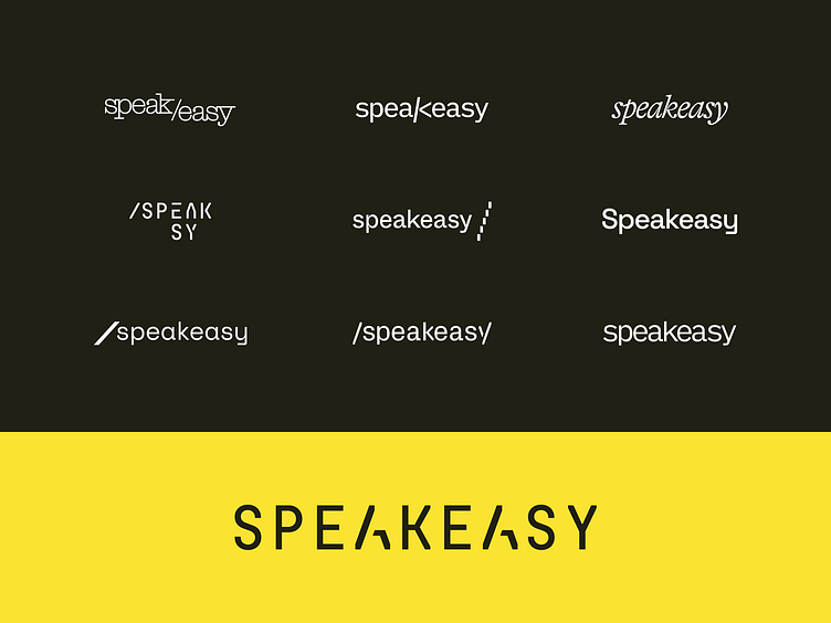
Speakeasy Logo Exploration
We love reflecting on the logo exploration process. 🙌 To properly inform the new Speakeasy brand, we started by defining the core attributes:
👉 Innovative
👉 Crafted
👉 Prolific
With these attributes as a guiding light, we got to work iterating on their updated logo. While each of these iterations has its charm, the final logotype is distinct and ownable. It perfectly embodies the attributes of the new brand. Consisting of technical, monospaced letterforms in which the “A” character is crafted to create two forward slashes — a direct reference to API endpoints and a direct correlation to their innovation and craft.
Learn more about our work with Speakeasy in the case study: https://odibrand.agency/work/speakeasy
---
Looking for a brand agency? We would love to hear from you.
Email us: hello@odibrand.agency
Our Website / Instagram / LinkedIn / Twitter


