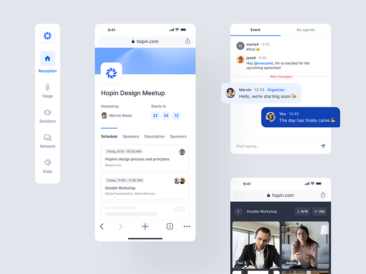
Hopin — Case Study 🎟
Hey guys,
Sharing a throwback to what we’ve been up to in 2020, designing the MVP and design system foundations for Hopin. 8 months after the launch, this online events platform became the fastest-growing startup in SaaS history and a double unicorn.
Our exploration began by introducing the idea of Reception – a virtual space not unlike an actual reception, where the user has access to information on an event’s speakers, its schedule and is free to chat away with any other onlookers in-between talks. Providing a neat summary of a meeting, the goal behind Reception was to be a self-explanatory, immediately intelligible run-through of a user’s day.
Seamless was what we aimed for throughout the Hopin experience. Each of the product’s features was being designed simultaneously to cater to both mobile and desktop users’ needs. Hop onto a meeting on your laptop and take it with you on the go – we promise you won’t notice any difference.
Providing intuitive building blocks for all future designers to come, we’ve created a collection of repeatable components and a set of standards that guide their usage. Our design system combines all the assets anyone working on the team will need to ensure seamless onboarding and coherent design throughout the client’s range of products.
Want to learn more? Check out the full case study on our website.
—
Visit our team profile! More stuff coming soon.
Do you need some help?
Send us a message: contact@widelab.co


