Whiteboard
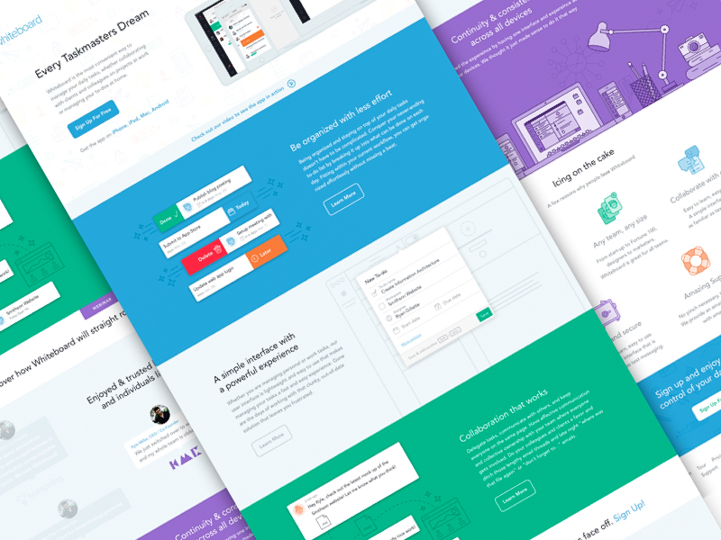
A couple of months ago Whiteboards CEO contacted me to be a part of their redesign. We were immediately in line with the direction for the marketing website. It was decided that full illustrations and a colorful palette would really give the product a human vibe. The task management app would be in such an overly saturated market it became crucial to separate Whiteboard apart from the crowd. The design was meant to demonstrate Whiteboard’s collaborative forward approach acting as a work task management app and a personal to-do list.
Attached are a few screens from the project. Full case study will be up on the site soon!
More by Kyle Anthony Miller View profile
Like


