Profile Screen Concept
Day 006 of the daily UI challenge
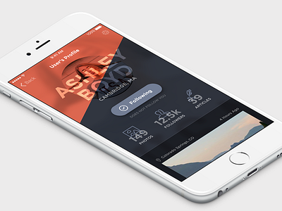
Put together a profile screen for a photo + article social network. Something between instagram and medium. I guess that would just be tumblr (but this would be cool, guys, i promise).
Anywho, playing around with different blend modes on the text and overlays on the images. I would want users to be able to choose what top color they get, obviously Ashley has chosen a red in her profile. Also wanted to experiment a bit with icon usage and how they interact with text.
Pretty happy with the top section, would like to play with the photo/article section a bit more. Real pixels attached, broh.
More by Aaron Tenbuuren View profile
Like

