AI writing website landing page redesign
Sharing my recent work- Landing page redesign for an AI writing tool.
Allow me to share the design decisions section by section below:
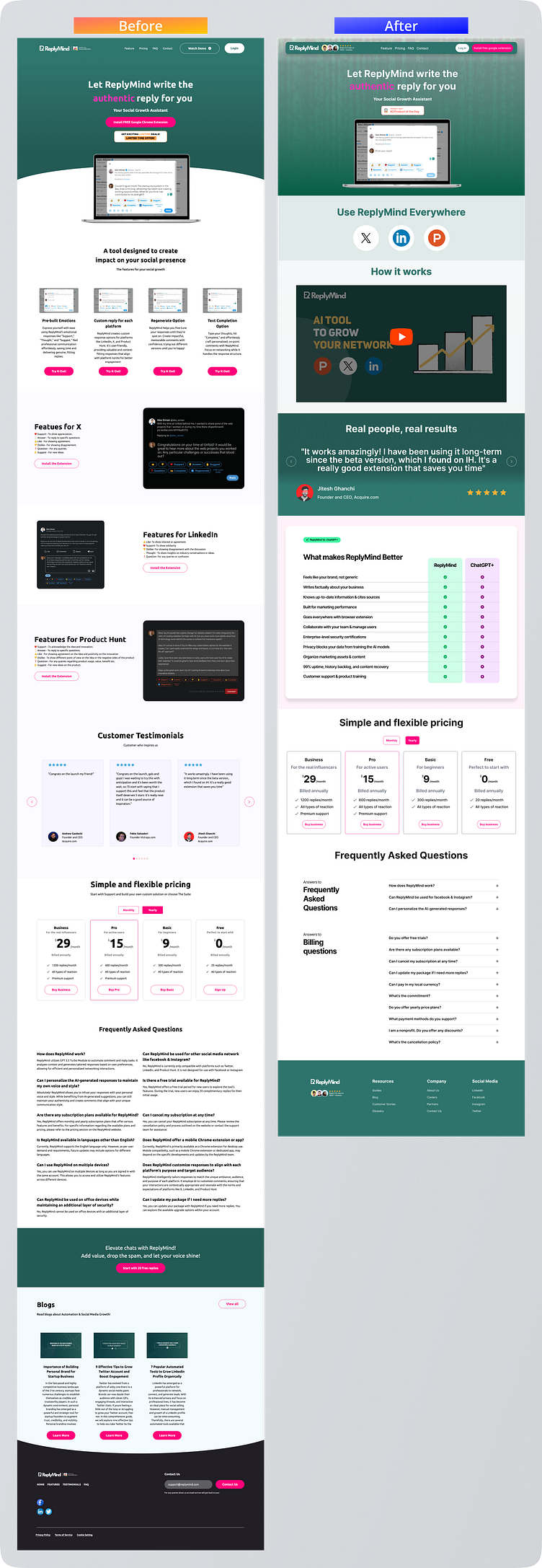
I pulled the demo GIF above the fold, so users can see the software in action without needing to scroll down. In the header section, I replaced the Google Chrome extension button (because it was redundant) with social proof (since it is very important for this type of software).
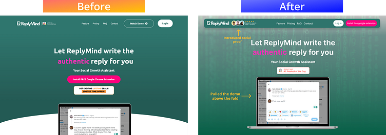
I also added a parallax effect to recreate the Buzzwords animation in current website
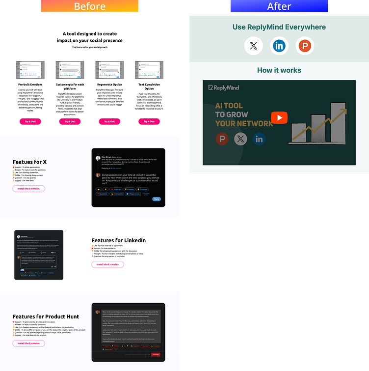
The current website has too much text, so the users may lose interest. So I placed the demo video from the header section to the home page, replacing all the text with a 4-minute video.
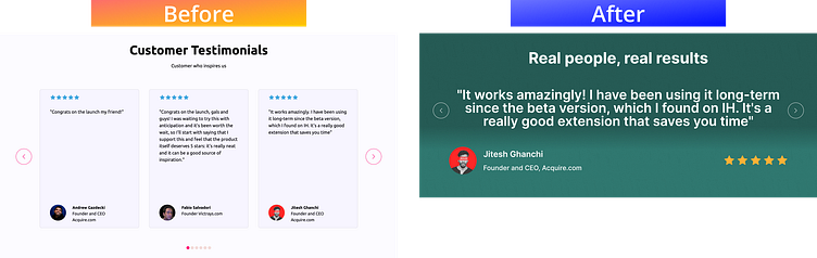
I redesigned the Testimonials section to utilize the Singularity Effect .
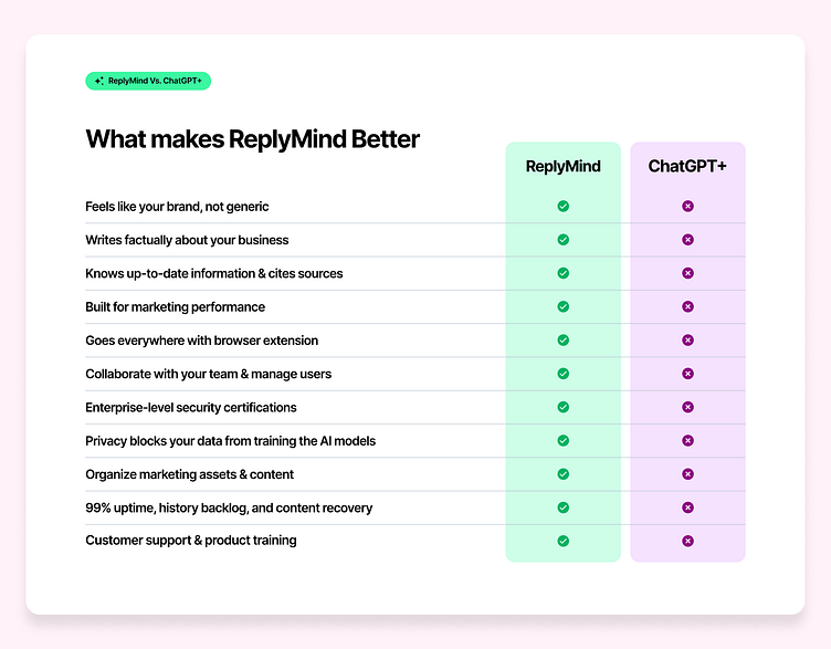
I added a comparison section to ChatGPT+, the industry leader, to explain our product's value proposition to users.
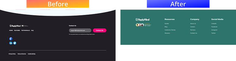
Finally, I redesigned the footer section to make it more visually appealing and match the overall design of the landing page.