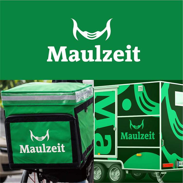
Maulzeit: Nature-Inspired.
When amalgamating three key ideas in the logo to convey the essence of the company, it's imperative to first provide a synopsis of the project. Maulzeit represents a wholesome and natural street food initiative housed in a mobile caravan, ensuring delivery accessibility through various means, accommodating even individuals with disabilities for order dispatch.
The design intricately weaves the letter "M" with a fork and a joyfully ready-to-eat mouth. The chosen color palette serves to embody the themes of nature, health, and joy, creating a visual representation that resonates with the core values of the project.
More by Godizayn View profile
Like
