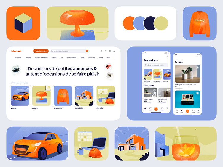
Leboncoin - Redesign concept ☀️
What's the idea behind this project?
What if I tried my hand at a Leboncoin redesign concept? 🙃
This is the somewhat unlikely idea I had between two projects. Leboncoin is a platform that I love, that I use regularly, but I thought it deserved a little boost.
So I took the plunge, with no expectations or pretensions, just for fun:
- I redefined a complementary color palette with orange to create a real universe without distorting the brand's image. Orange is essential, and it was important that it always found its place in the charter.
- I created a series of illustrations representing leboncoin's flagship categories: vehicles, objects, clothing, real estate and jobs. The aim was to be able to use these different illustrations directly in the product.
- I then focused on the product and created mobile and web application screens to see if this new charter worked. Overall, I kept the spirit of leboncoin, and didn't make any impactful changes to the navigation, concentrating instead on information architecture, iconography, typography and space management.
- I created a new icon for the application, more in line with this new charter, while retaining the spirit of the "parcel".
What tools do I use?
Figma
Who I am?
I'm a freelance product designer passionated about mobile applications and an users lover.
My website
I am open to new projects


